
Automative trouble stranded me up on the mountain most of the day, but drove down into Kentville as the sun was setting to get a few things done at the print shop. Namely, I had to score the jackets for our new edition of George Elliott Clarke’s Whylah Falls. We have to ship a substantial order for a university course already underway, so I didn’t want the books to sit here an extra day just because I spent part of my morning ineptly crawling around on the wet ground under a truck.
This cover was printed offset in two colours (black and gold) on a felt-finish cover stock. The image is a duotone, which combines the gold and the black. In order to score the folds, I hand feed book jackets into a 1930s vintage Chandler & Price platen press. It is one of my favorite machines in the print shop. We bought this one from a shop that was closing down in Halifax back in 2000. When scoring, the ink rollers are removed and the chase has steel rules locked into it which score the folds in the jacket. These presses look dangerous, but they are perfectly fine so long as you rigidly adhere to some pretty common-sense safety practices (like keeping your back straight and not following a mis-fed sheet into the closing mouth of the press). This press sheet is about 10 × 20 inches in size, so it takes a little practice before you can feed them this quickly. You have to grab it in just the right place and use the air under the sheet to float it into place.
George’s book should be available for shipping, ohh, by mid-morning Thursday.
ANDREW STEEVES ¶ PRINTER & PUBLISHER
29 September 2010
28 September 2010
Press Notes

Tim Bowling’s new book is now on the press. I think it has the longest title of any book we’ve ever published, that is if you include the sub-sub-title that I invented when I was setting the title page. Perhaps I’ve been reading too much about 17th century books lately. Their long run-on titles have always amused me.

Bowling’s book is uses a version of Dwiggin’s Electra type, which are contemporary to much of the the subject matter in Tim’s book. Electra is a type that always looks gaunt and underfed without the ink swell of letterpress, so this book introduces a tuned up version of the face that’s a bit heavier and replicates the warmth and colour I have always had trouble achieving with it in offset printing.

Wolfville artist Jack McMaster did the illustration for the book jacket. Jack, Tim and I were putting the finishing touches on the jacket today.

Also sneaking through the pressroom early this week is a short catalogue for an exhibition of Thaddeus Holownia’s photographs at the Windsor Gallery in Vancouver which is opening next month. It contains a nice essay by Peter Sanger.
ANDREW STEEVES ¶ PRINTER & PUBLISHER
21 September 2010
Skibsrud on Giller Long List

Johanna Skibsrud: Pre-Giller Long List
Gaspereau Press is pleased to discover that Johanna Skibsrud’s novel The Sentimetalists is on the Scotiabank Giller Prize long list. The list, selected by CBC’s Michael Enright, American writer Claire Messud and UK writer Ali Smith, looks something like this:
David Bergen, THE MATTER WITH MORRIS (Harper Collins)
Douglas Coupland, PLAYER ONE (Anansi)
Michael Helm, CITIES OF REFUGE (M&S)
Alexander MacLeod, LIGHT LIFTING (Biblioasis)
Avner Mandelman, THE DEBBA (Random House)
Tom Rachman, THE IMPERFECTIONISTS, (Random House)
Sarah Selecky, THIS CAKE IS FOR THE PARTY (Thomas Allen)
Johanna Skibsrud, THE SENTIMENTALISTS (Gaspereau)
Cordelia Strube, LEMON (Coach House)
Joan Thomas, CURIOSITY, (M&S)
Jane Urquhart, SANCTUARY LINE (M&S)
Dianne Warren, COOL WATER (Harper Collins)
Kathleen Winter, ANNABEL (Anansi)
Johanna is over the moon, of course (and in Paris, which never hurts). Everyone here at Gaspereau is pleased too, but circumspect as usual. Long lists can mean very little for actual book sales, though the soft benefits are critical.
When we are running behind (and this year, we are running very behind) an award nomination can mean that we end up having to decide whether or not to delay fall books in order to print more copies of the nominated book in case there is a sudden demand that exceeds our present inventory. And what if you reprint a book and then the sales are illusionary? That can quickly take a book from break-even to loss. We have to consider whether it is better to fill big retail orders for the promotional displays that have been organized around the award instead of filling orders from small booksellers, and whether shorting the chain stores will preempt the inevitable returns or hurt sales. There's a lot of balance, and a lot at stake.
In fact, when all is said and done, we’ve often found that long lists and short lists only result in increased book returns (unless the book actually wins). Sometimes it feels like we’ve only loaned the big retailers stock to fill out their displays. But why would we think that a retail system that does a poor job of selling literary titles to the public all the rest of the year will suddenly succeed during awards season?
So where is the line between careful management and simply being an awards wet blanket?! When you run a literary press, and you run it on a shoestring, you have to be careful not to drop the ledger, the dictornaty, or the ink knife while you’re strapping the party hat under your chin and blowing up the balloons. You have to keep things in perspective.

Johanna Skibsrud: Post-Giller Long List
Having books on long lists or short lists can be reassuring and amusing too. Nominations bring us into contact with many aspects of the publishing trade from which working in a small Nova Scotian town usually insulates us. People who are usually disinterested in our press suddenly act as if they are diehard supporters. We get calls from journalists in Toronto who have determined the story’s angle (small regional press is dark horse nominee for important national award) before they even call, and boy are they frustrated if you suggest a more complex reality. Agents, editors and publishers come fishing for rights knowing little or nothing about the book, the author, or the press other than that it was on the Giller long list. And organizers and publicists call, working so hard to convince us all that something very, very important is afoot. Nice as some of these people are, these encounters reassure me that I'm not missing much by working outside the mainstream of the publishing world.
I know that for some authors who win major awards, the experience has a transforming influence on their career. Winning a prize can be the thing that lands you an agent, or a better publishing deal, or a deal in a foreign territory – to say nothing of the monetary prize and the psychological boost of approval. These are good things as far as they go. And as embarrassing as the boosterism of national awards can be, and as corrosive as their cattle-shoot effect can be on our thinking about literature, I think we sometime expect a little too much of these awards. They are what they are.

The Sentimentalists won first prize in the fiction ctegory of the 2010 Alcuin Awards for Canadian Book Design. Illustration by Wesley Bates
Why wouldn’t the Giller Prize be any less complex and contradictory than the culture and the literature it aims to promote? The Giller short list will be announced on October 5th, and I would like very much to discover that The Sentimentalists is on it. And we’ll happily wrestle with whatever complications, challenges or indignities come with it, approaching them with the same grin and tenacity as everything else we deal with around here. Because at the end of the day, I feel that we ought to take Mr. Rabinovitch and his ilk at face value as wanting simply to promote good fiction. While I wouldn’t want to live in the media cycle and trade publishing culture surrounding such awards indifferently, or engage them as my guide to literary excellence, The Giller Prize is at least doing something positive in aid of a cause that is important to me. I’ll embrace their way of helping literature, as I trust they also embrace mine.
ANDREW STEEVES ¶ PRINTER & PUBLISHER
16 September 2010
Shopwork

The fall list is well underway here in the shop, but I wiggled some time free yesterday to print a broadside commissioned by Halifax poet Matt Robinson. We’ve been doing a fall broadside for Matt for a number of years now, and I always look forward to trying to give his poems some sort of typographic presence. Sometimes we use an image, but more often than not we simple play with type. This year we used Rod McDonald’s type Slate.

I had some trouble with pin holes in my polymer. Sometimes no matter what you do you can’t get the dust out of wherever the dust is hiding. I ended up taking different letters from different plates and cobbling the form together, just as I would with wood type. The ink on the large type is a mix of blue and silver inks. Maybe 40% silver. I didn’t exactly measure things where this was a one-off.

Speaking of Matts, our own Matt has the first side of the sheets for the new edition of George Elliott Clarke’s Whylah Falls printed and will likely be printing the second side today or tomorrow. This page has a trumped-up newspaper clipping. George and I both get a kick out of small town-newspaper-speak, especially corrections and notices. For me, this interest goes back to my short career in journalism and my life-long interest in newspapers.

Today, I’m working on the jacket for Clarke’s book. We wanted to echo the imagery of the earlier editions of the book while doing something that was uncluttered and clearly in the Gaspereau look. The type is Jonathan Hoefler’s high renaissance flavoured Requiem. (Jonathan, like me, turns 40 this year.)
I’ve been blustering around the printshop like a dog with a bone, muttering, keeping odd hours, making strange utterances. Must be Fall. Gary, like me, is trying to juggle too many things all at once, managing the shopwork, dealing with orders and accounts, fixing broken equipment. Let’s just say I haven't seen the cribbage board out at lunchtime in a while. Well, we'll have to change that when Laura the queen of cribbage gets back. She is still away on her Nashville road trip. Basma has been filling in for her, helping Connie and Gary keep things moving through the bindery. Matt, our pressman, seems remarkably calm for a fellow who’s about become a father for the first time, and any day now. And speaking of firsts, the other day he quizzed Gary and I up about the upcoming wayzgoose (Saturday October 23), and seemed excited by the idea of the shop being full of curious people. But there's a lot to accomplish before then.
ANDREW STEEVES ¶ PRINTER & PUBLISHER
15 September 2010
Michael Winter declared Honourary Gaspereau Press Author in absentia
In this clip, Newfoundland author Michael Winter takes a page from that old Marx Brothers ‘cut the deck’ gag and demonstrates a high degree of editorial acumen. If you weren’t a fan of Mr. Winter’s work, you would of course add a quip or a barb here, but I like the man’s work. And I like the the way he cranks that chainsaw to life with one pull. (Likely warmed up in rehearsal.) Anyway, given his keen sense of humour and skill with the Stihl, well, by the power invested in me I hearby declare Michael Winter an honourary Gaspereau Press author, with all the rights and privileges conveyed with that high office (invitations to Christmas parties, scrap paper, typographic advice, free parking in downtown Kentville...). Michael, drop by the next time you’re in Nova Scotia and we’ll discuss your grand future as an honourary Gaspereau Press author.
ANDREW STEEVES ¶ PRINTER & PUBLISHER
Two Editions of Bringhurst’s Selected
Hard-core collectors and bibliophiles will be interested to know that our colleagues at the storied publishing house Jonathan Cape in London (now an imprint of Random House) recently acquired UK rights to Robert Bringhurst’s Selected Poems, which was originally published by Gaspereau in 2009. Cape's edition is now out, and was recently reviewed by Erica Wagner in The Times.

Jonathan Cape’s new edition of Bringhurst’s Selected Poems has a simple and attractive offset-printed cover. The colours are reproduced using a CMYK process. The book has cover flaps and a black end sheet. A pretty spiffy edition for a big trade publisher.

Gaspereau Press’s original edition of Bringhurst’s Selected Poems. The jacket employs a black felt-finish paper handprinted in two colours on a letterpress. I’m not sure that it’s better or worse than Cape’s; it’s just a different process and it gets a different result.
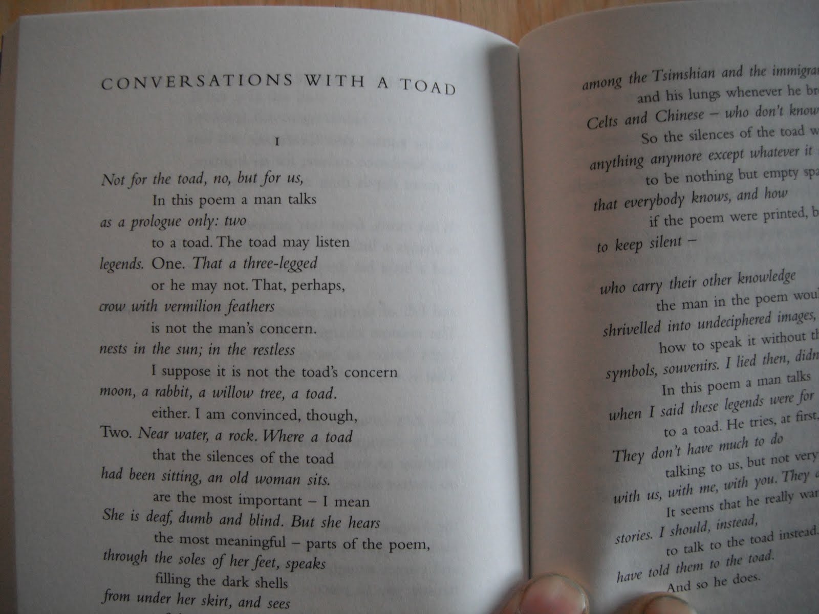
When we resell rights to publishers in other territories, I'm always excited to see how they handle the material. Editorially, the Cape edition is a somewhat different selected. They wanted a slightly smaller selection. They were also unable to budget for the printing of Bringhurst’s polyphonic works in multiple spot colours. Much of the polyphonic work was simply omited, but a few things, like “Conversations with a Toad,” appear in monochromatic form. Robert has only rarely been able to convince publishers to shoulder the expense of his experiments, so he is used to this problem. In the Gaspereau edition, however, we used a fair amount of spot colour.

The Cape setting of “Conversations with a Toad.”

The Gaspereau setting of “Conversations with a Toad.”
Neither Robert nor I had any hand in the design of the Cape edition, which was done by a firm in England. And Cape has a house style for its poetry series. On the whole, the typography of the Cape edition is clean, simple and workmanlike. The type is Bembo, which generally works well, though wonky spacing is a problem here and there. The generally over-wide word spacing, for example, seems at odds with the modest leading. (Compare the word spacing in the two samples above.)

What’s Robert thinking in this photo? Perhaps he’s thinking “You could drive a bus between the word spacing in that bio! Would a hyphen have killed you?” I know I am.
Well, a few typographic differences of opinion aside, it is a great little book and a credit to its publisher. Hats off to the gang at Jonathan Cape for bringing Bringhurst to the United Kingdom.
ANDREW STEEVES ¶ PRINTER & PUBLISHER

Jonathan Cape’s new edition of Bringhurst’s Selected Poems has a simple and attractive offset-printed cover. The colours are reproduced using a CMYK process. The book has cover flaps and a black end sheet. A pretty spiffy edition for a big trade publisher.

Gaspereau Press’s original edition of Bringhurst’s Selected Poems. The jacket employs a black felt-finish paper handprinted in two colours on a letterpress. I’m not sure that it’s better or worse than Cape’s; it’s just a different process and it gets a different result.
When we resell rights to publishers in other territories, I'm always excited to see how they handle the material. Editorially, the Cape edition is a somewhat different selected. They wanted a slightly smaller selection. They were also unable to budget for the printing of Bringhurst’s polyphonic works in multiple spot colours. Much of the polyphonic work was simply omited, but a few things, like “Conversations with a Toad,” appear in monochromatic form. Robert has only rarely been able to convince publishers to shoulder the expense of his experiments, so he is used to this problem. In the Gaspereau edition, however, we used a fair amount of spot colour.
The Cape setting of “Conversations with a Toad.”

The Gaspereau setting of “Conversations with a Toad.”
Neither Robert nor I had any hand in the design of the Cape edition, which was done by a firm in England. And Cape has a house style for its poetry series. On the whole, the typography of the Cape edition is clean, simple and workmanlike. The type is Bembo, which generally works well, though wonky spacing is a problem here and there. The generally over-wide word spacing, for example, seems at odds with the modest leading. (Compare the word spacing in the two samples above.)

What’s Robert thinking in this photo? Perhaps he’s thinking “You could drive a bus between the word spacing in that bio! Would a hyphen have killed you?” I know I am.
Well, a few typographic differences of opinion aside, it is a great little book and a credit to its publisher. Hats off to the gang at Jonathan Cape for bringing Bringhurst to the United Kingdom.
ANDREW STEEVES ¶ PRINTER & PUBLISHER
09 September 2010
John Terpstra on Art Waves

Two interviews with Gaspereau Press author John Terpstra have recently been posted on-line. The interviews are from the program Arts Waves, hosted by fellow Hamilton poet Bernadette Rule.
I first met John when he was touring his poetry collection The Church Not Made With Hands, published by Wolsak and Wynn in 1997. Anyway, we became fast friends. It was John who introduced me to the wood engraver Wesley Bates and to the thriving arts community in Hamilton. When I was myself touring in Ontario in 1998, one of the best readings I gave was actually to an audience gathered in John and Mary Terpstra’s living room on Herkimer Street in Hamilton.
I’ve always agreed with the Canadian publisher Jack McClelland’s notion that a publisher publishes authors more than he publishes books, and I’ve been lucky enough to have formed great friendships with many of the writers and artists I’ve worked with. When you believe in someone’s vision and skill, you want to do everything you can to help them on their way. John is one of those writers who is the heart and soul of the Gaspereau Press list – like Pierre Berton or Farley Mowat were to McClelland’s M&S. I befriended John at a point when he was at a sort of crossroads as a writer, working with great uncertainty on what was to become his first major prose project, Falling into Place, a book that is a sort of meditation on the Iroquois Bar – a giant glacial sandbar and present day transportation corridor in Hamilton. I think John brought it to Gaspereau because he knew that we understood what he was trying to accomplish and trusted our commitment to his literary vision.
This relationship has resulted in some pretty astonishing books, including Restoration (2000), Falling Into Place (2002), Disarmament (2003), Brendan Luck (2003), The Boys, or, Waiting for the Electrician’s Daughter (2005), Two or Three Guitars: Selected Poems (2006), and Skin Boat (2009).
The first interview was broadcast on December 21, 2008. In it, John talks about making the move from poetry to prose with his first Gaspereau Press publication, Falling into Place, about the balance between writing, cabinetmaking and carpentry, and about his celebrated memoir about his brothers-in-law, entitled The Boys or Waiting for the Electrician’s Daughter.
The second interview was first broadcast in September 13, 2009. John’s talks about his most recent book Skin Boat, a book which tries to understand the appeal of faith and faith communities in the modern world.
ANDREW STEEVES ¶ PRINTER & PUBLISHER
02 September 2010
Wayzgoose Time is coming!
Gaspereau Press is pleased to announce that it will hold its 2010 Wayzgoose and Open House on Saturday October 23rd. This year’s wayzgoose will feature guest letterpress artist Amos Paul Kennedy, Jr., of Alabama. Amos will be whooping it up in the print shop with Gary and I during the day on Saturday. We’re also pleased to announce that Saturday evening’s Book Arts talk will consist of a discussion between Amos and Nova Scotia filmmaking sensation Sylvia Hamilton, moderated by yours truly. I suspect that the discussion will touch on such things as film-making, making art, rural communities, the impact of race and cultural differences on artistic expression, and the secret to making a sandwich which can sustain you through to suppertime.
Here are two links if you wanted to find out more about these extraordinary people:
Also, on Wednesday October 20th, the Acadia film society will be screening the film Helvetica in honour of the Gaspereau Goose. Please visit their website for details. Below is the film trailer:
I suppose a tentative schedule would be useful? So far, this is what we have planned:
SATURDAY MORNING
9:00 to noon: Bookbinding workshop with Ruth Legge. (30$ registration fee. Space limited. Email info@gaspereau.com to reserve.)
9:00: Author’s Brunch. An informal gathering at a local restaurant for writers of all sorts. Details and ‘host’ to be announced.
10:00 to noon: Drop in for some printshop chicanery: Take advantage of the offcut paper sale, participate in an informal papermaking symposium with Gary Dunfield, or chat with Amos Kennedy, Jr., and Andrew Steeves as they set up equipment for the afternoon’s open house. Free admission.
SATURDAY AFTERNOON
2:00 to 4:30: Open House at the printshop, with demonstrations and entertainments of all sorts, featuring Amos Kennedy, Jr. Free admission.
SATURDAY EVENING
7:00: Author readings (TBA) and Annual Book Arts talk, featuring a conversation with Amos Kennedy, Jr., and Sylvia Hamilton. Free admission.
Well, that’s the shape of it so far. I’ll post details as the evolve.
Amos is being brought to the province in partnership with the Nova Scotia College of Art and Design and the organizers of the annual wayzgoose in Newfoundland, so if you can’t catch him in Kentville, keep your eyes peeled for events in Halifax and St. John’s.
ANDREW STEEVES ¶ PRINTER & PUBLISHER
Subscribe to:
Posts (Atom)

