29 September 2012

Tramp Printer Report No. 2


Ferry crossing from Digby, Nova Scotia, to Saint John, New Brunswick. (Tuesday 25 September)


Signage in the belly of the Digby–Saint-John Ferry. Never seen that typeface anywhere before.


Fall colours and construction signage on twisty Highway 7 between Ottawa and Peterborough, Ontario. I needed a little Canadian shield before taking on several days of Great Lakes Basin.


I skirted north of Toronto and paid a surprise visit to the Inksters at The Porcupines Quill in Erin Village, Ontario. (Wednesday 26 October)


Tim Inkster suggested that the first picture of a printing press on my half-continental printing road trip be of James Reaney’s little Nolan proof press, which he recently aquired and which presently lives in his warehouse. Reaney (1926–2008) was an Ontario poet and playwright. Between 1960 and 1971 he edited the journal Alphabet: A Semi-Annual Devoted to the Iconography of the Imagination.


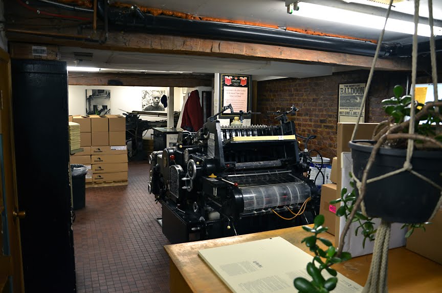
The pressroom in the basement of The Porcupines Quill, Erin, Ontario. This is an offset Heidelberg KORD press on which the Inksters produce books for the trade market.


Wild letterforms: I stopped for the night in the east end of Hamilton, Ontario, to check in on my three Ontario nephews.


I had a great visit and lunch with my friend Will Rueter at The Aliquando Press in Dundas, Ontario.


Rueter’s Vandercook press. “Oh, Don’t photograph that! It’s a mess.” Yes, but it’s a mess made while making something worthwhile. And not much of a mess by the standards of my printshop.

After visiting The Aliquando Press I drove to Queenston, Ontario where I visited the extraordinary Willowbank School for the Restoration Arts and spent an evening of stimulating conversation with its director, Julian Smith, and staff members Adam Smith and Lisa Prosper. (Adam was an architecture student at Dalhousie University in Nova Scotia couple of years ago and we became friends when he was researching his thesis, which involved some discussion of the links between typography and architecture; I also gave a talk at Willowbank back in 2011.)


In the morning I crossed the border at Fort Erie and drove around the bottom of Lake Erie and Lake Michigan on Interstate 90 for about fourteen hours. The highlight of that drive was certainly hitting Chicago at rush hour. (In my neighbourhood, the worst I usually get on my drive home is encountering cows on the road in the village of Gaspereau if I’m driving home at milking time, so an hour-and-a-half crawl past Chicago at 25 mph or less was a novelty.) The photo is of the wonderful signage on the toll gate on Chicago’s Skyway bridge – the only bridge I’ve ever been on where they charge you a toll not only to get on, but also to get off.


I made it to the northwest corner of Illinois and (finally) out of the sprawling flat sameness of landscape that comprises the lakeshores. This morning (in Freeport, Illinois) I woke up within an hour of the Mississippi River. Yahoo!

ANDREW STEEVES ¶ PRINTER & PUBLISHER

24 September 2012

Tramp Printer Report No. 1


Well, feeling fiddlefooted and wanderlusty, I figured it was time to escape the confinement of the printshop and point my pick-up somewhere southerly and see what’s going on down there. Says I to no one in particular, I think I’d like to see the Mississippi River. And there is an election going on down there, just to make things interesting. So I contacted some letterpress printers and strung together a little tour of a few American printshops. I’ll try and post some photos and commentary from the trip as I go. Stay tuned.

ANDREW STEEVES ¶ PRINTER & PUBLISHER

19 September 2012

Love and The Mess We`re In


A page opening from Love and the Mess We’re In

The Globe & Mail’s John Barber was kind enough to give some ink (yes the Globe & Mail still uses ink) to Gaspereau’s new book by Stephen Marche, Love and the Mess We’re In. In the quotes he selects from his interview with Marche and in the way he frames his article, Barber implies that Marche and I are spearheading some astonishingly retrograde, rearguard action in support of a dying art form. I guess if you have to dress it all up like that to sneak a story about a small-town press into the national newspaper, fill your boots. But the reality is not quite so dramatic.

Despite all that has been written about the death of the book, the truth is that it hasn’t gone anywhere and is unlikely to do so for sometime yet. There were lots of other publishers who released nice-looking, well designed trade books this fall, books on which much care and attention was lavished. They were released by a range of firms, big and small. Most of them were not produced by nutty zealots or commercially-indifferent artisans. They were released by people like me, people who care about books and make a living publishing for the trade market.

Sure, the trade has seen some interesting shifts toward ebooks in commercial and genre fiction (all that pleasurable snack-reading for planes and subways), but for readers of Canadian literature, the trend has been less significant so far. No surprise, paper still dominates. Any student of history will tell you that the transition from the manuscript book to the mass-produced printed book was no different – slow and gradual – and that a viable commercial trade in manuscript books carried on parallel with the flashy new printing trade for several generations after moveable type took Europe by storm in the late fifteenth century. A mere few years into the Kindle and iPad is simply too early to announce the collapse of a half-millennium of the printed book, or to portray as a novelty authors like Marche who still think the printed book is a relevant and robust form of expression.


She thinks / She says / He says / He thinks

And of course you can read this text on a screen. I designed the damn thing by looking at a screen and moving electronic representations of type and lines around with a keyboard and a mouse, so it certainly can be accessed and understood in that medium. It’s not for sale in an electronic format at this point, but that’s not to say that it can’t or won’t be. However, as Marche hints at in his expressions of bibliophilia in the Globe & Mail article, an electronic picture of book pages is not the same thing as a book. They cannot and should not be equated. They can both convey the text, but the experience (and perhaps the implications) of using them is quite different. When Marche wrote this novel, and when I designed it, it was the physical codex format of the book and the characteristics of its pages which we had in mind. For us, the paper book is the ultimate expression of this creative activity. But we could certainly translate it into other media, and you could certainly read/view/hear it with similar satisfaction if you were at all at home with those other media.

I don’t want to poke at Barber, whose genuine interest in (and occasional puzzlement about) Gaspereau’s vision of contemporary book publishing I sincerely appreciate. He’s doing his job, looking for a story angle that will draw in the readers; that in turn helps me sell more books. But when he calls what we do “archaic,” “old-fashioned,” and “artisinal” I think he may be both misunderstanding the nature of tools (the hammer, the knife and the screwdriver are old tools too, though we make wholly relevant, contemporary things with them and no robotic equivalent will ever completely eliminate them) and diverting the focus away from the place it belongs: the text. No one should buy this book because it is beautiful or unusually made. They should buy it to read it. At Gaspereau Press, beauty and utility come at no extra charge.


At one point in Marche’s novel, the narrative is expressed in the form of a re-imagined New York City subway map which is printed in colour and tipped into each book.

ANDREW STEEVES ¶ GASPEREAU PRESS

16 September 2012

Scrutiny: Holownia & Starnino


A publisher and an author examining the fine print on a book contract? No, nothing like that. Thaddeus Holownia took this photo of me and Gaspereau Press author Peter Sanger a few weeks ago at Sanger’s home in South Maitland. We were planning the production of a catalogue for an exhibition of Holownia’s photographs opening at the UNB Arts Centre this coming Friday in Fredericton, NB. The show, entitled ‘Water’ is a sort of retrospective which gathers photographs from across Holownia’s career which deal with that subject. Sanger wrote a catalogue essay, which was be printed, with its French translation, here at Gaspereau Press and will appear under Holownia’s Anchorage Press imprint. In his essay, Sanger writes:

The subjects of all of Holownia’s photographs, especially those in this exhibition, are elemental in substance and particular in happenstance. […] The theme of water is new in its emphasis in this exhibition, old in its presence in Holownia’s work. It has often appeared as one of the images in Holownia’s series of photographs devoted explicitly to other subjects. By choosing photographs from a body of work extending over thirty years, therefore, Holownia emphasizes a latency.

The show opens at 5:00 p.m. on Friday 21 September and runs until 22 October 2012. The gallery is located in Memorial Hall on the University of New Brunswick campus.

In the photograph above, Sanger and I are discussing the printing methods employed to produce a sheet from The Nuremberg Chronicle (c.1493), which just happened to be resident in South Maitland.


Also on the press this week is Lazy Bastardism, a book which collects essays and reviews by Carmine Starnino, one of Canada’s most outspoken literary critics. We’ve published two volumes of Starnino’s poetry, but this is the first time we have issued his critical work. Starnino’s first book was published the same year we launched Gaspereau Press. About that time I heard him being interviewed on a national CBC Radio program, talking about poetry with a sharp-tongued, sharp-minded passion. As I listened, Starnino’s polemic (for he was much more polemical in his early days) made me by turns angry and amused, but it never failed to engage me. I knew I had to meet this guy, and eventually, I did (over a drink at Ottawa’s Manx Pub with John Metcalf, as a matter of fact).

I have always felt that blunt, direct, fearless commentary is as essential to a literary culture as similarly feisty journalism is to a free and open society. I’ve no time for name-calling or mere meanness, but I cannot take the side of any argument which argues for the suppression of open debate. Critics will always have their weaknesses, their favourites and their bugbears, and they will slip-up, from time to time, and over-salt their broth. But between those moments they have much to teach us, starting with the importance of bothering to pay attention to what others are writing and expressing an opinion about it. As Starnino writes by way of introducing his collection:

One day you sit down for a beer with a buddy and you say, ‘you know what? I can’t read x anymore’, and he says, ‘why?’ and you say, ‘this is why’. That is the seed of criticism. That’s where it starts. And the tradition would not exist – poetry itself would not exist – if those conversations did not happen, and if poets did not take the time to turn those conversations into well-written, well-argued prose.

If we feel that literary culture is important, we need to roll up our sleeves and engage those around us. Hearing someone say ‘This book disappointed me,’ or ‘This poem didn’t, in the end, succeed,’ is so much preferable, even if I disagree with their conclusion, to the bland, polite applause or (worse) resounding silence with which most contemporary poetry is met.

ANDREW STEEVES ¶ PRINTER & PUBLISHER

10 September 2012

Books and The Mess We're In

In September, you’d be hardpressed to find a horizontal surface in the printshop which is not stacked high with a book-parts – jackets, covers, press sheets, folded signatures, sewn book blocks ...

Smyth-sewn book blocks waiting to be bound into covers

The first of the fall books coming off the presses is Stephen Marche’s novel Love and the Mess We’re In. As novels go, it is a project that required some pretty intensive collaboration between the author and the designer. Generally speaking, every page spread is carefully choreographed. There are spreads where the right-hand and left-hand pages carry the text of different speakers and the way their lines interleave indicate the cadence of the conversation, including the gaps. There are spreads where the text is set in geometric shapes or patterns. There are text blocks set within text blocks. It’s all quite playful, and is an inventive way to tell a story. The body text is set in Ross Mills’ robust and colourful Huronia type.

Left: The author’s ‘sketch’ of a page in Love and the Mess We’re In. Right: The typographer’s realization of the author’s sketch.

One of the peculiar design requirements of this book was a revamped map of the New York City subway system. Jack McMaster prepared the base map for me, and I spent days typesetting the altered stop names in Rod McDonald’s soon-to-be released Classic Grotesque types. The maps were printed in colour, folded and tipped into each book.

Detail from Marche's revamped New York City subway map.

Like most of our books, Love and the Mess We’re In is bound into a paper cover with a letterpress-printed jacket. The cover proper is usually the last thing in the book I design, and I often print a pattern in silver on black 80 lb paper stock. In this case, I played with circles and a square, shapes which are important in the book’s page design.

Unbound covers for Love and the Mess We’re In.


Patterns made by a stack of jacket-less books.

I decided to change the spot colour on the two-colour letterpress jackets five times during the print run for the first printing (‘wayzgoose’ red, orange, grey, green and blue). I like introducing elements like this to a trade book, elements which undermine the idea that everything could or should be perfectly the same across an edition.

Letterpress jacket coming off the press.


When it comes to manufacturing, we have this expectation that you could buy a left-foot, size-nine, brand-name shoe in St. John’s, Newfoundland, and fly to Vancouver and essentially buy its mate. Certainly you can pick up copies of the same blockbuster novel off a skid in any Costco across the country and effectively have the same object. It’s amazing how the machinery of manufacturing and distribution has come to make this possible, but what does that sort of ‘quality control’ really have to do with quality? Little. It is too often a uniform blandness that has been achieved instead.

And this is why I like to introduce some wiggle into our books. When you are printing by hand, there are no copies per say, but every sheet that comes off the press is in effect an original print. No two books are alike. I also tend to let the ink density vary slightly (within reason) which creates different effects. And in some more mischievous moments, I’ll change colours or papers, either mid-run or when I reprint for a second edition. I like the idea of someone discovering a variant copy of a book they own on someone else’s bookshelf, of that unsettling moment of discovery – Hey, I have this book, but this copy is different than mine! Yup, it is.

Stephen’s book will be released this coming Friday.

ANDREW STEEVES ¶ PRINTER & PUBLISHER

07 September 2012

Wayzgoose Coming October 20th


Well, it has been a hectic summer, and I have been a negligent blogger. As we rush to prepare books for the fall season, let me ease my way back into the spirit of things by posting the poster for our upcoming Wayzgoose and open house, to be held on October 20th.

Our special guests this year are master papermaker David Carruthers of the Papeterie Saint-Armand in Montreal and letterpress printer and printmaker David Brewer of Rabbittown Press, Fredericton. There will also be readings by authors Carmine Starnino and Heather Jessup.

The schedule of events will be roughly thus: You can attend a Literary Salon with Carmine and Heather at 10:00 Saturday morning, an informal chance to talk to authors about the craft of writing. Meanwhile, we’ll be setting up in the printshop from 10:00 until noon, and keener artists, bibliophiles, typenuts and printers are invited to drop in, hang out and talk shop while we prepare for the afternoon open house. We also usually have an offcut paper sale in the morning. The Open House itself will officially run from 2:00 until 4:30, with lots of papermaking, printing and typecasting demos. In the evening, the authors will be reading at 7:00 and the Lochhead Memorial Book-Arts Lecture will be shared by short presentations by papermaker David Carruthers and myself. Watch for locations and other details as we get closer to the event.

ANDREW STEEVES ¶ PRINTER & PUBLISHER