Today
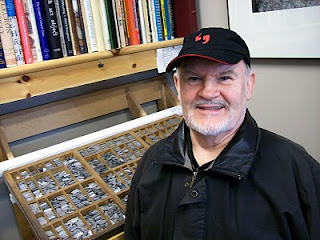
Rod McDonald, one of this country’s foremost type designers, left the warm serenity of his basement studio at Lake Echo, Nova Scotia, and dropped down to the valley for a visit to the printshop and lunch at the local pub. Before ordering lunch, Rod and I lamented that the pub no longer uses the menus I designed for them several years ago using Rod’s Laurentian typeface; since they changed the menu, the food prices have gone up and the typographic quality has gone down.
We had a sort of typographer's lunch at this pub a few years ago with Rod, Glenn Goluska,
Will Rueter, Gary Dunfield and myself. I remember how exasperated the waitress got trying to take drink orders while the bunch of us typophiles were having an animated discussion about how well Rod’s type worked on the menu. “He
designed this typeface,” I said to the young woman, thinking this would explain everything. She answered with a blank stare. I guess she'd never thought about where letters came from before.

Rod’s been making letters for a living since the age of 14, when he started working as sign painter. He’s best known in Canada and around the world for his skillfully made digital type families:
Cartier Book, his refinement and completion of a typeface begun by Carl Dair;
Laurentian, his incredible Garamond-flavoured type originally developed for
Maclean’s magazine; and
Slate, a sans serif family which functions well in an astonishing range of applications.

Laurentian finds frequent use at Gaspereau Press. Originally designed as a magazine type, Laurentian has turned out to stand up quite well to general use as a text type. A few years ago, with encouragement from Robert Bringhurst and myself, Rod added a set of extended descenders and a more lyrical Q to the character set, additions which I think enriched the type. I've used it to set poetry books (Michael deBeyer's
Change in a Razor Backed Season and Johanna Skibsrud's
Late Nights with Wild Cowboys), complex works of philosophy (Jan Zwicky's
Wisdom & Metaphor and the forthcoming
Lyric Philosopy), journals (
Parenthesis 15,
Atlantic Geology and
The Blomidon Naturalists Society Newsletter), and everything in between, from menus to templates for bronze casting. It's one of the sharpest tools in my typographic toolbox.
*
On the way home I stopped and dug around in the university archives for a while. I ended up looking through a portfolio of sheets printed in Italy during the incunabula. One sheet I was looking over was printed in 1478 by the Venetian punchcutter and printer
Nicolas Jenson. What a thrill to discover a small piece of fifteenth-century print heritage here in the small town where I live.

Two superb digital revivals of Jenson’s letterforms are Centaur and Adobe Jenson. Centaur, originally a metal type, works best printed letterpress, but Jenson is built to withstand the demands of modern papers and printing techniques.

So, a good day with type designers from both the fifteenth and the twenty-first centuries.
Andrew Steeves ¶ Printer & Publisher


 Posts
Posts

