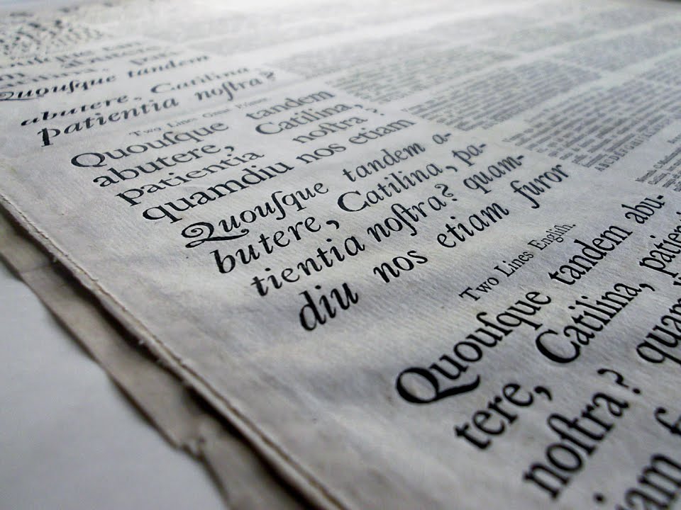
Curious Masonry
I was pleased to learn that we’d taken first place in the Poetry category for my design of Christopher Patton’s Curious Masonry: Three Translations from the Anglo-Saxon. This was a challenging book to design: A bilingual text, long footnotes, and a sort of concrete-poem remix of one of the translations that had to be eased from the manuscript page (8.5 × 11) to the book page (5.3 × 8.5) with minimal compromise. The type I used was Poliphilus and Blado, a roman and italic pairing first released by Monotype in 1923. The roman is based on a type cut by the Balognese punchcutter Francesco Griffo (d.1518); the italic is based on the work of Ludovico degli Arrighi (d.1527). Of course, the Anglo-saxon characters required to set this text were not present in the off-the-shelf version of the font and so I had to make them myself. I also created a slightly more robust version of the font which allowed me to set the footnotes in a smaller size while maintaining an even ‘colour’ to the text block. The jackets were handprinted on my vandercook, with a jumble of the two texts struck blind with a great deal of bite into the cover. I felt this conveyed the difficult and murky task of translation. All and all, this book represented all the sorts of challenges that get me excited when designing a book, and I was pleased it tickled the judges too.

The jacket was given a nice hard inkless whomp! with a letterpress

Anglo-Saxon on the left, English translation on the right

Patton’s creative rendering of “The Earthwalker”
Incitements
Sean Howard’s Incitements also uses a classic British Monotype face: Plantin, a stout, richly coloured type based on the work of Robert Granjon (d.1590). My digital version of Plantin has been equipped with extended ascenders and descenders like those which Frances Meynell’s Nonesuch Press special-ordered from Monotype back in the days of metal type. Howard’s poems employ a sort of cut-up technique which clips and reorders a vocabulary from a source text to create a new work, and I tried to create a typographic title page and jacket that communicated that jumble. I also introduced a pilcrow more in keeping with the type’s sources.

The jacket for Incitements, stretched out

The title page spread

Folio location a problem as always on pages of modern poetry.
The Shell of the Tortoise
On the otherhand, Don McKay’s The Shell of the Tortoise used Deepdene, an original American typeface designed by Frederic Goudy, typographical advisor to the Lanston Monotype company. Goudy originally drew it in 1927, and like so many types designed with the sculptural bite of letterpress in mind, Deepdene has had a difficult time finding its place in the world of digital typesetting and offset printing. At least I’ve always had trouble making it sing. But it sings along pretty nicely in McKay’s The Shell of the Tortoise, a book which also just won Don the 2011 BMO Winterset Award.

The front of the jacket, with an illustration by Wesley Bates

The back of the jacket, with a paper bio-wrapper

A spread showing the trouble of balancing a folio, a chapter header, a subheading and footnotes. The footnotes are infrequent and so use traditional symbols instead of numbers
Anyway, thanks again to the Alcuin Society for the great work that they do to promote good book design in Canada. You can find a full list of winners by visting the Alcuin Society website.
And by the way, Gaspereau Press’s books are not the only well designed things you can find in Kentville. Earlier this year, the Kentville Police Department was awarded second place in a “best dressed police vehicles in Canada” competition, the results of which were published in the January 2012 issue of Blue Line Magazine. “From certain angles they add a bit of an Italian exotic flavour,” the magazine said of our cruisers. Hmm. Sounds like our typefaces. Seriously. Here’s a link to the story as published in the local newspaper.
Personally, I’m nostalgic for those old 1970 with the white doors with the crest and the single bubble-gum-machine light on top.
ANDREW STEEVES ¶ PRINTER & PUBLISHER