18 April 2011

Salon: Book Night with the Guys


Steven Slipp cooking smelts

For pushing a decade now, I’ve been getting together sporadically with a group of local fellows for what I can only describe as an anti-book-club meeting. That is, we don’t all read the same book and then get together to discuss what we liked or didn’t like about that book, like some high school English class for adult learners. No, when we get together we all sweep bound contents of our bedside tables into a rucksack and bring our individual adventures in reading to share and debate with the other fellows. More often than not, we talk as much about what is afoot in local politics and the media as we do about the books. I suppose in many ways you’d more properly call this sort of thing a salon, but that sounds a little too urbany coming out of my spruce-gum-scented mouth.


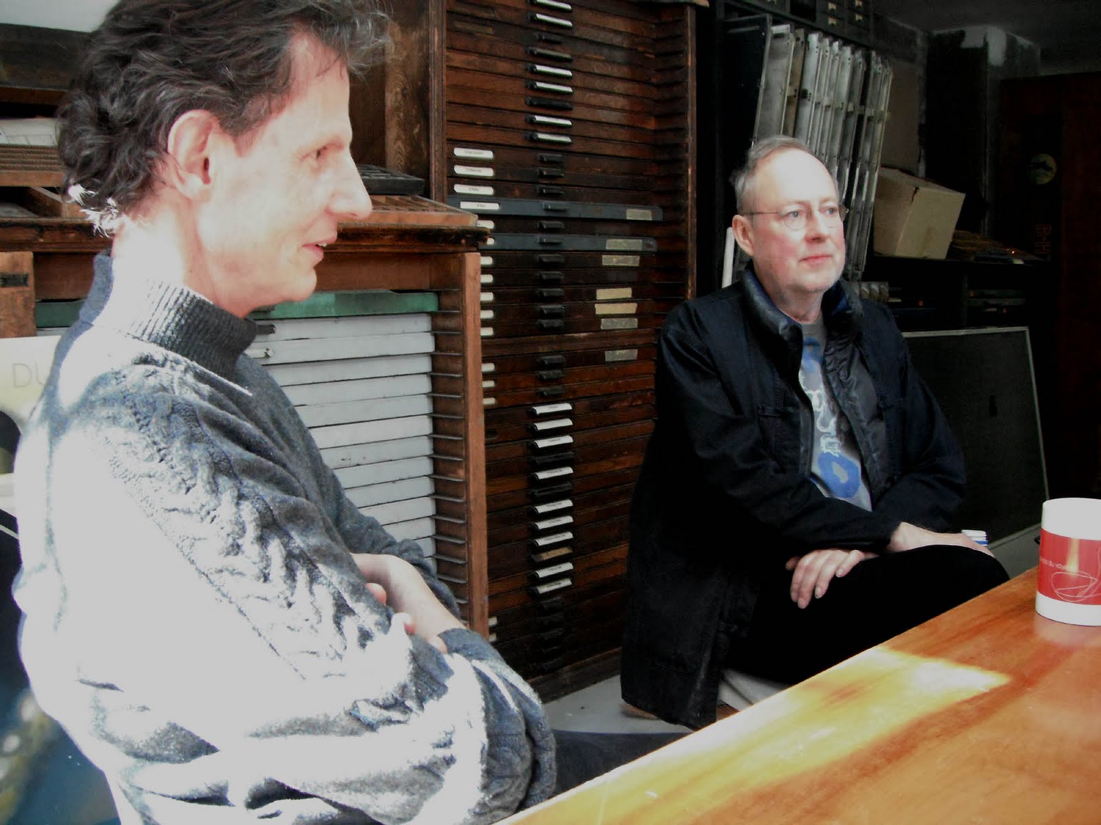
Ed Thomason and Steven Slipp (and a fried smelt)

The most recent salon was hosted by Stephen Anderson, a bonne vivant who works in international development in the area of food aid and ‘rural livelihoods’, commuting between Wolfville and Africa. When I arrived, Steven Slipp was displaying his catch of smelt, presently running up the Gaspereau River on the incoming tides.(Steven is a local designer whose work you’ve likely seen if you’ve ever licked a postage stamp in this country – the loon, the polar bear and the moose stamps to name a few – or followed a wayfinding sign in Halifax Airport)

Also present were Michael Cussons (Irish-born country doctor, bicycle enthusiast, and James Joyce booster) and Ed Thomason (English-born playwright, director, Bob Dylan fanatic and the present executive director of Festival Antigonish). There are other members of the this salon, but I’ll punish them for their non-attendence by not mentioning them here. Better show up next time guys.


The rabble: Myself, Michael Cussons and Ed Thomason

The books I took to discuss were a history of the Doves Press, George Walker’s graphic novel about the day before the World Trade Center attacks (Book of Hours, published by Tim Inkster at the Porcupine’s Quill), The Etiquette of Freedom (interviews with Gary Snyder and Jim Harrison, published by Jack Shoemaker at Counterpoint), and a catalogue Francis Meynell did for the Pelican Press. There was a rather involved discussion about purpose created content (as in whether a film made for the big screen really could ever be at home on an ipod screen), prompted in part by Michael’s expressed desire to see George Walker’s engravings from Book of Hours dispayed framed on the wall instead of bound into a book (and was it really a novel anyway, where was the text?). We also had a long talk about how, despite his old-fashionedness, Dickens often seems to have a much broader scope and is able to communicate a much broader and much more detailed picture than most modern novelists. This was prompted by Ed’s bringing Dickens’ Dombey and Son. He was going to read aloud from it, but I made the mistake of asking him if he felt there were any similarities between Dickens writing his novels in bits and pieces for periodicals and Ed’s own work on radio plays broadcast in series, and we never got back to his reading from Dickens. As is typical of these gatherings, the books often get left behind as we follow this or that thread, follow it until we’ve completely lost our way or something brings us around to someone else’s book with a "well it's funny that you would mention French Impressionism, because I’ve just been reading ..."


Michael: "Good lord! Thoreau again! Enough of it. Let's get back to Ulysses."

Anyway, after much wine and chatter about books and reading, I’m afraid that it all descended into Ed, Stephen and I playing music until nearly 2:00 am.

ANDREW STEEVES ¶ PRINTER & PUBLISHER

14 April 2011

Poetry Books for the Trala!


We’ve been in high gear this week getting two books together in time for our annual Poetry Trala! (with Coach House Books and Signal Editions) in Toronto next week. Sean Howard’s Incitements is printed, sewn and bound and was merely (until minutes ago) waiting for the jackets that I have been letterpress printing on a Vandercook hand press.


One of the interesting things about Howard’s book is that his poems are made up of text from other books. Most literary works build upon and are indebted to the texts that preceded them in the literary tradition, but Howard’s technique actually mines three books specifically – Peter Sanger’s literary essay White Salt Mountain, Merritt Gibson’s guidebook Summer Nature Notes and Hans Fallada’s novel Every Man Dies Alone – uncovering new relationships and resonances in the prose and remixing them as poetry.


I printed the jackets in three colours on a felt-finish stock: black, PMS 187 ‘wayzgoose red’, and a warm grey which was custom mixed with complete and utter disregard for replication. I have a soft spot for warm grey inks and varnishes – things that can’t be replicated in the slight-of-hand of cyan, magenta, yellow and black dots that dominates most commercial printing.


The typeface I used in Howard’s book is a customized digital version of Monotype Plantin. Released in August 1913, Plantin was one of the earlier revivals developed for the Monotype composition caster. Shortly after its release, special characters (longer ascenders and descenders and a few other niceties) were commissioned from Monotype by the English typographer Francis Meynell for use at the Pelican Press and later Nonesuch Press, but these are unfortunately absent from modern digital versions. Those wishing to use ‘Nonesuch Plantin’ must sharpen their digital gravers & files and make their own. You can read more about Monotype Plantin in an excellent paper by Brigitte Schuster, who adapted her own digital verion of Plantin while studying at the Royal Academy of Fine Arts at The Haag, The Netherlands.

*

The other book we’re getting ready for the Poetry Trala! is George Elliott Clarke’s new collection, Red. When Clarke and I were batting around ideas for the design of the book, he presented me with a folder of artwork produced by his late father, Bill Clarke, who dabbled (in the best sense) in visual art throughout his life. As George eloquently speculated, his father seemed to understand “that art could free an Africadian from the genial humiliations of a reluctantly bestowed, strictly stereotyped, and poorly remunerated j-o-b?”


Among the papers I found a study Bill had made of an uppercase alphabet, with a few lowercase letters as well. They were rough drawings, but I thought it appropriate to scan them and convert them into an equally rough digital font. George was thrilled by this, and we used “Bill Clarke’s Caps” on the book’s cover and title page. The body type is Adobe’s Garamond Premier Pro, a digital revival of types designed by the French punchcutter Claude Garamont (c. 1490–1561) designed for Adobe by Robert Slimbach.


All the sheets for Red are printed, and we’ve begun folding and sewing the book blocks for binding tomorrow. As usual, it feels like a race to the finish line, but also, as usual, it’s a joyful race to be running.

ANDREW STEEVES ¶ PRINTER & PUBLISHER

13 April 2011

Bowling up for Two Alberta Literary Awards

Gaspereau Press is pleased to announce that Tim Bowling has been shortlisted for two Alberta Literary Awards, organized by the Writers Guild of Alberta.

Bowling’s memoir, In The Suicide’s Library, has been shortlisted for the 2011 Wilfrid Eggleston Award for Nonfiction. In the meantime, his poetry collection The Annotated Bee and Me has been nominated for the Stephan G. Stephansson Award.


Awards jurors have deliberated 164 submissions to select 25 finalists in eight categories. Finalists represent extraordinary literary work written by Alberta authors and published in 2010. Winners will be announced and awards presented at the Alberta Book Awards Gala on Saturday June 11, 2011.

Celebrating its 30th anniversary this year, the Writers Guild of Alberta is the largest provincial writers’ organization in Canada, and was formed in 1980 to provide a meeting ground and collective voice for the writers of the province. Its mission is to inspire, connect, support, encourage and promote writers and writing, to safeguard the freedom to write and to read, and to advocate for the well-being of writers.

I’m quite fond of both of Tim’s nominated books, and am pleased to see them recognized in his home province. But I’m especially excited about In The Suicide’s Library, which I think is one of the most engaging and original books of prose Bowling has produced to date. It’s release was somewhat overshadowed by the clattering for The Sentimentalist, but somehow I suspect that that Bowling’s book might have a more lasting impact and a longer shelf life, building its audience slowly by actually being read more than by being read about.

Why do I think so? Well, In The Suicide’s Library is as good a book about books and the literary life as I’ve ever read, and everyone I’ve recommended it to agrees. It chronicles Bowling’s strange eight-month quest into American literature of the 1940s and ’50s and the world of book collecting, a journey branching into a wealth of subjects ranging from the relationship between fathers and daughters, suicide, masculinity, the Internet, the history of printing, bibliomania and the strange effects of midlife and obsession on an otherwise rational mind. At the book’s centre is Bowling’s astonishing discovery of a particular book. One day, alone in the Modern Literature stacks of a university library, Bowling opens a tattered copy of Wallace Stevens’s poetry collection Ideas of Order and, on the front flyleaf, finds the elegant ownership signature of Weldon Kees—an obscure American poet, painter, photographer, filmmaker and musician who vanished mysteriously in 1955, an apparent suicide off the Golden Gate Bridge. As the story unfolds, Bowling faces two central questions: the one that Weldon Kees put to his friend, Pauline Kael, on the day before he vanished—“What keeps you going?”—and, perhaps even more important, is it ever acceptable to steal a book for your own collection?


Not to overshadow The Annotated Bee and Me! Interestingly, it also takes another book as its departure point, this time, a slim volume which Bowling’s great aunt had privately printed in 1961—a memoir of her family’s beekeeping adventures in Edmonton between 1906 and 1929. The first section of the book weaves Bowling’s own verse together with excerpts from The Bee and Me, resulting in a sort of long poem which is part tribute to kin and part lament for modern life. In the second section, titled “Out of the Hive, Into the World” Bowling wrestling with the “confusion of loving too much the world.” Its poems touch on family, literature, salmon fishing and beekeeping lore, hinting at how in facing the unvarnished facts of one’s brief life one might honestly annotate their experience: “You build an immunity over time to Time / or you fall among the dried husks of the bees / on the grass.”


ANDREW STEEVES ¶ PRINTER & PUBLISHER

11 April 2011

A few Alcuins for Gaspereau Press

The Alcuin Society announced its list of the best-designed books in Canada last week, and a few Gaspereau Press productions merited a mention. This year four of my book designs were selected – one first, a second, and two honourable mentions.

One of the categories we usually do well in is the poetry category. While you’d think that poetry would be the very heartland of well-designed books, I’ve come to believe that the opposite is true. Of all the genres, trade publishers seem to invest the least money and attention in the design and production of poetry books, sending many of our culture’s most astonishing literary accomplishments into the world in rather shabby, thoughtless dress, ill-equipped for their journey through the ages. But not so at Gaspereau.

This year, the design of Paul Tyler’s poetry book, A Short History of Forgetting, was awarded first prize by the Alcuin judges. It is set in my customized version of Fournier, accompanied by my own Memorial Hall ornaments. (Fittingly, the ornaments are based on the borders of the stained-glass windows in Memorial Hall at the university of New Brunswick, windows I first noticed while attending Ross Leckie’s poetry weekend a couple of years ago.)


The jacket for Paul Tyler’s A Short History of Forgetting


A spread from Paul Tyler’s A Short History of Forgetting


We took second place in the Reference section for a very different sort of book, St. Andrews Architecture, 1604–1966 by Fredericton architect John Leroux and photographer Thaddeus Holownia. Vancouver type designer Ross Mills was kind enough to let me use a pre-release version of his new type face, Huronia, for this book, which had just the right wonky and warm arts-and-crafts feel about it to bring the text alive on the book’s coated paper. One of the challenges with a book like this is (as usual) to balance form and function. It was important to me that it occupy a place between a compact guidebook and a large-format photography book, drawing on the strengths of both approaches to arrive at a book that was portable, function and beautiful all at once. (This book also has a Memorial Hall flower on the title page, given that John Leroux was the one who pointed me to the windows in the first place.)


The Cover of St. Andrews Architecture


The title page of St. Andrews Architecture


A spread from St. Andrews Architecture


The honourable mentions were both in the Prose Non-fiction category (in which the judges awarded no second or third place prizes). Tim Bowling’s In the Suicide’s Library and Peter Sanger’s Through Darkling Air are quite different books, and not typical of the books which usually win in this category.

Bowling’s book is a memoir about mid-life, bibliomania and 20th century American poetry, with special attention to the life of the poet Weldon Kees. Jack McMaster made a beautiful illustration for the jacket, and I set the book in one of the best-ever American book types, Electra, designed by W.A. Dwiggins. I’ve designed a number of books in Electra, but I think that this is the first one in which I’ve actually managed to use the type in the media of offset printing with anything approaching the impact that it has in letterpress. I’ve given this book to a number of bibliophiles and booksellers, and every one of them have raved about it. I think time will demonstrate it to be one of those Gaspereau ‘classics’ like Clarke’s Execution Poems, McKay’s Vis à Vis, or Terpstra’s Falling Into Place.


Jack McMaster’s illustration for the jacket of In the Suicide’s Library


The illustration spun into a pattern for the inner cover of In the Suicide’s Library


The wordy title page of In the Suicide’s Library


A chapter opening from In the Suicide’s Library


Sanger’s Through Darkling Air is an unconventional publication as well, being Sanger’s extensive study of the life and poetry of Richard Outram. It was casebound by hand at Gaspereau with colour plates illustrating many of Outram’s rare broadsides and books issued by his Gauntlet Press. Set in Minion Pro, this is the most extensive publications to be issued by Gaspereau – other than the forthcoming edition of Jan Zwicky’s Lyric Philosophy.

The jacket and wrapper for Through Darkling Air


The printed cloth cover for Through Darkling Air


The printed endpapers for Through Darkling Air


A spread from Through Darkling Air


For a complete list of this year’s Alcuin winners, and a list of locations where the books will be exhibited in the months to come, you can visit the Alcuin Society’s web site.

In the meantime, we’re all hard at work on this year’s new crop of books, starting with poetry books by Sean Howard (Incitements), George Elliott Clarke (Red) , and Jan Zwicky (Forge). George and Sean will be reading in Toronto at our annual Poetry Tra-la on April 20th, in conjuction with Coach House Press, Signal Editions, and Ben McNally Books (info to follow).

By the way, if you are wondering why you haven’t seen a Gaspereau Press catalogue, it’s because we didn’t issue one this spring, opting instead to invest time and resources in overhauling our web site (coming soon!) and, well, recovering from last fall’s Sentimentalists shenanigans, which left us extremely behind in our regularly scheduled work. We’ll be issuing a larger catalogue in early summer to get things back on track.

ANDREW STEEVES ¶ PRINTER & PUBLISHER

07 April 2011

A Trip to Goluskaville


Glenn Goluska in his apartment

For a number of years now, and almost without fail, Montreal-based typographer and letterpress printer Glenn Goluska has been making an annual fall trip to Kentville to attend the Gaspereau Press wayzgoose. Year after year I’ve promised Glenn that I’d drop in and visit his printshop near the Lachine Canal in Montreal. As a carrot, Glenn’s been holding a promised copy of one of his more famous letterpress broadsides as bait, insiting that I come by and collect it in person.


The Goluska Printshop

It’s no simple thing to escape the responsibilities of our under-staffed and overworked printshop. But at the end of March, I finally made good on my promise, driving up to Montreal for a two-day visit and taking Rod McDonald – designer of the typefaces Laurentian, Cartier Book, Slate Sans, Smart Sans … – as my copilot. No surprise, type and design occupied at least 75% of our conversation over the duration of our 20-some-hour round trip.

Glenn Goluska, I should mention, is one of the most astonishing typographic designers I’ve encountered in this country. His portfolio of trade design work includes a veritable library of literary books designed during his heady early days at Coach House Press in Toronto, an incomparable collection of posters and catalogues designed for the Canadian Centre for Architecture in Montreal, and countless book jackets designed for McGill-Queens Press. A few examples (taken quickly, in poor light):


Glenn’s also an accomplished letterpress printer and Linotype operator, and his Imprimerie Dromadaire and Nightshade Press are responsible for many stunning private press publications. Some of my favorites include Alexander Urusov’s The Cry of Distant Ants (1978), Margaret Atwood’s Unearthing Suite (Grand Union Press, 1983), Scott Joplin (1983) and Robert Kroetsch’s Liebhaber’s Wood Type (1987). By amd large, the type for these books was composed on Glenn’s Linotype model 31 caster using and his excellent collection of Linotype typefaces – Electra, Falcon, Palatino, Optima, Metro Black, Trump. He has also handset many pieces from the hundreds of drawers of lead and wood type he has collected over the years, including a number of rare fonts of Cyrillic.


The cover of bpNichol's continuum


A spread from Alexander Urusov’s The Cry of Distant Ants (1978)


Cover of Scott Joplin (1983)


A spread from Robert Kroetsch’s Liebhaber’s Wood Type (1987)

We spent most of our visit sitting around in cafes, restaurants and in the printshop talking about printing and type, but Rod and I also made contact with a few other folks who are active in Montreal’s typographic scene. On Friday, we visited Judith Poirier at the University of Quebec at Montreal. Judith made a short animated film called Dialogue by printing directly on the filmstock using lead type and a vandercook proof press. Her book about the film, also called Dialogue, won an honourable mention at the Alcuins and was shortlisted at the 2010 Leipzig Book Fair. Judith’s letterpress work uses type playfully, more as a graphic element than as a system to construct words, paragraphs and books.


Judith Poirier & Rod McDonald at UMAQ

The work of typographer and Dawson College instructor George Vaitkunas is more of my ilk. Vaitkunas joined us for a chat and Linotype demo in Glenn’s shop on Saturday afternoon. He’s designed some great award-winning books over the past few decades for publishers like Douglas & McIntyre and UBC Press. I expect that we’ll soon find an excuse to invite him to speak at a future wayzgoose.


George Vaitkunas & Glenn Goluska in Goluska's shop

Paper maker David Carruthers also dropped by for a quick visit, though a plan to tour the St. Armand paper mill didn’t work out due to time constraints.

Well, it was a quick trip, but an inspiring one. On the drive home, Rod and I talked at length about the influence Glenn’s work and friendship has had on our own careers and the impact his work would have on the next generation of designers if his work was actively used in the teaching of graphic design in Canada. Like so many of the best typographers, his work is not as widely known as it could be, mostly because Glenn has worked away quietly all these years, perfecting his art, not drawing undue attention to himself or his work.

In encountering Glenn’s typographic design I have often found, as in Thoreau’s writings, unanticipated companionship in the confirmation of things I had long been muddling through and sorting out on my own, discovered that my own peculiar ideas and seemingly idiosyncratic methods of working them out had previously – with equal peculiarity and idiosyncrasy – been worked out, and sometimes in an uncannily similar fashion, by Goluska on his own journey of learning the art of book design. This discovery is not unlike overhearing the dialect of your native village spoken by a stranger in on the other side of the world: your head turns involuntarily toward its familiar music; you recognize it, and it recognizes you, and you are suddenly at home.

ANDREW STEEVES ¶ PRINTER & PUBLISHER

01 April 2011

Edible Book Day


Gaspereau Press celebrated International Edible Book Day today, lunching on book-themed treats prepared by Basma, Trina and Ceri. Our special surprise guest was musician and Gaspereau author Bob Snider who just happened to wander in for a visit as festivities were getting underway.

The menu included: Trina’s rice paper wraps (with poems written on the rice paper); Ceri’s cracker, cheese and carrot booklets and ‘book choy’; and Basma’s super sweet chocolate type, complete with chocolate-dipped graham crackers ‘leads’.


ANDREW STEEVES ¶ PRINTER & PUBLISHER