We’ve been in high gear this week getting two books together in time for our annual Poetry Trala! (with Coach House Books and Signal Editions) in Toronto next week. Sean Howard’s Incitements is printed, sewn and bound and was merely (until minutes ago) waiting for the jackets that I have been letterpress printing on a Vandercook hand press.

One of the interesting things about Howard’s book is that his poems are made up of text from other books. Most literary works build upon and are indebted to the texts that preceded them in the literary tradition, but Howard’s technique actually mines three books specifically – Peter Sanger’s literary essay White Salt Mountain, Merritt Gibson’s guidebook Summer Nature Notes and Hans Fallada’s novel Every Man Dies Alone – uncovering new relationships and resonances in the prose and remixing them as poetry.

I printed the jackets in three colours on a felt-finish stock: black, PMS 187 ‘wayzgoose red’, and a warm grey which was custom mixed with complete and utter disregard for replication. I have a soft spot for warm grey inks and varnishes – things that can’t be replicated in the slight-of-hand of cyan, magenta, yellow and black dots that dominates most commercial printing.

The typeface I used in Howard’s book is a customized digital version of Monotype Plantin. Released in August 1913, Plantin was one of the earlier revivals developed for the Monotype composition caster. Shortly after its release, special characters (longer ascenders and descenders and a few other niceties) were commissioned from Monotype by the English typographer Francis Meynell for use at the Pelican Press and later Nonesuch Press, but these are unfortunately absent from modern digital versions. Those wishing to use ‘Nonesuch Plantin’ must sharpen their digital gravers & files and make their own. You can read more about Monotype Plantin in an excellent paper by Brigitte Schuster, who adapted her own digital verion of Plantin while studying at the Royal Academy of Fine Arts at The Haag, The Netherlands.
*
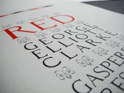
The other book we’re getting ready for the Poetry Trala! is George Elliott Clarke’s new collection, Red. When Clarke and I were batting around ideas for the design of the book, he presented me with a folder of artwork produced by his late father, Bill Clarke, who dabbled (in the best sense) in visual art throughout his life. As George eloquently speculated, his father seemed to understand “that art could free an Africadian from the genial humiliations of a reluctantly bestowed, strictly stereotyped, and poorly remunerated j-o-b?”

Among the papers I found a study Bill had made of an uppercase alphabet, with a few lowercase letters as well. They were rough drawings, but I thought it appropriate to scan them and convert them into an equally rough digital font. George was thrilled by this, and we used “Bill Clarke’s Caps” on the book’s cover and title page. The body type is Adobe’s Garamond Premier Pro, a digital revival of types designed by the French punchcutter Claude Garamont (c. 1490–1561) designed for Adobe by Robert Slimbach.

All the sheets for Red are printed, and we’ve begun folding and sewing the book blocks for binding tomorrow. As usual, it feels like a race to the finish line, but also, as usual, it’s a joyful race to be running.
ANDREW STEEVES ¶ PRINTER & PUBLISHER


No comments:
Post a Comment