31 January 2010

Reformers, Troublemakers & Outlaw Printers

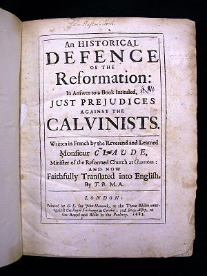
Back to the Baroque. Huguenot cleric Jean Claude (1619–87) entered the ministry in 1645 and moved through numerous teaching and pastoral posts in his native France, courting much controversy with his anti-ecumenical views. Toward the end of his life, he fled to Holland after Louis XIV revoked of the Edict of Nantes in October 1685 (which effectively made Protestantism illegal in France). While hiding out in Holland, Claude received a pension from über-Protestant English prince William of Orange, who commissioned him to write a book on the persecution of French Huguenots. On May 5, 1686, that publication and its English translation had the distinction of being publicly burnt by London’s common hangman, by order of William of Orange’s father-in-law and pro-Catholic King of England, James II. They were complicated times.


Recently, I looked at one of Claude’s earlier publications, pictured above. An Historical Defence of the Reformation is the English translation of Claude’s Défense de la Réformation (1682). The translation was made by “T.B. and M.A.” and was printed by “G.L.” in 1683.

Larkin! – George Larkin was one of London’s notorious underground printers who defied the Crown's oppressive censorship of the English press in late 1600s. Loosely connected with the Baptists, Larkin started his outlaw adventures in 1666, printing no less than the first edition of John Bunyan’s Grace Abounding, an anti-clerical work by Ralph Wallis, and some satirical poems by Andrew Marvell. That’s a pretty formidable introduction to the book trade.

After narrowly escaping out the back door during a house search sanctioned by the Stationer’s Company in 1668, Larkin turned informant, ratting-out his fellow radical printers John Darby and Nathan Brookes to Sir Roger L’Estrange, overseer of the publishing trade by appointment of the Restoration court (and no stranger to publishing controversy in his own right). Even this alliance couldn’t keep Larkin out of harm’s way; his printing career was punctuated by surprise searches, fines and periods of imprisonment.


Back to this book. The type used by Larkin displays many of the same early-Baroque elements of those used in Mather’s A Sermon (printed at Boston in 1685) and D’Anvers’ A Treatise of Baptism (printed at London in 1674) which I discussed in earlier posts (See Older Posts).

One of the interesting attributes of this particular page is the way in which the sidenote is butted directly up against the main textblock with only a thin lead between them. However, in the upper right-hand margin you can see from the ghost of the note printed on the verso of this page that it is set with ample space between it and the main textblock. Notice the dagger used to mark the note in the main text (eleven lines down from the top) and that its form is slightly different than the dagger of the smaller-sized font used for the sidenote itself.


This font includes a number of ligatures, or single pieces of type which combine and link two or more letters. In modern digital fonts, ligatures for the combinations ‘fi’ and ‘fl’ are standard issue, but an extended pallet of ligatures for further f combinations (ff, ffi, ffl, fj, fb, etc.) and historical ‘discretionary ligatures’ or ‘quaints’ (ct, st, is, us) are often included with Opentypes fonts with extended character sets.

Speaking of discretionary, notice that one line uses the italic ligature for ‘us’ on two words, but not on the third. Is this simply an oversight on the part of the compositor?


Not only does the ligature save the compositor time, allowing him to set two letters while only reaching out to one compartment in the case, the single glyph is slightly more compressed than the combination of the single sorts ‘u’ and ‘s’, saving space. It’s also very beautiful.

ANDREW STEEVES ¶ PRINTER & PUBLISHER
30 January 2010

Double-Daggers & Asterisks

We had a pretty good blizzard on Friday, so I spent a great deal of the day at home by the wood stove, editing a book by Tim Bowling. In the book (due out this autumn), book collecting, bibliomania and the mid-life torments of the protagonist loom large, so it was no real surprise that by mid afternoon I had abandoned my post, bundled up in my back-country best and hoofed myself down to the special collections room at the university library to hang out with some old books. Alas, the room was closed due to the inclement weather. Seeing as I was there, I decided to roam around in the general stacks.

Now, while I had my heart set on spending that snowy afternoon with much older books, let it be said that there is a great deal of fun to be had in the general stacks. If nothing else, cruising the stacks reminds you that a well-designed book is a rare thing. As you run your hand along the spines of the books, what you see is more often than not the result of the lazy thinking, poor workmanship, and general meanness of the book trade. It can get depressing in a hurry. But every once in a while books come to hand which suggests cause for hope.


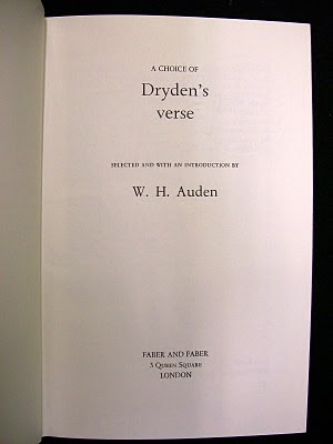
Two examples of such ‘ahh-ha!’ volumes from Friday come to mind. One is A Choice of Dryden’s Verse, published by Faber & Faber in 1973. In this volume, it was W.H. Auden doing the choosing. I generally like Faber’s designs from this era and earlier. They are almost always restrained and careful. Everything adheres to a simple hierarchy. There is no showiness here.


Well, almost no showiness. I snorted when I saw this uses of two double-daggers to bracket the folio (that is, the page number). I’d never encountered such a use of a double-dagger before. In fact, you rarely see this glyph used anywhere anymore, unless someone is typesetting using the traditional set of footnote markers to which it belongs. This use feels a bit unnecessary, calling undo attention to the folio, but the playfulness made me grin.


I also discovered a four volume set of The Complete Works of William Congreve which was published by the Nonesuch Press in 1923. It was issued in a limited edition of 900 sets, with this set numbered 470. One of the things that I like about the spine lables is the inventive use and arrangement of asterisks (another glyph from that traditional footnote set) to indicate the volume number.


Nonesuch Press was founded in London by Francis Meynell (1891–1975) in 1922, with its first book, John Donne's Love Poems, being released in May 1923. This Congreve set was also from that inaugural season.

One of Meynell’s ambitions was to demonstrate that modern composition and printing techniques and machines (Monotype casters and power presses) could produce books that was every bit as distinguished as (and a hell of a lot less expensive than) the books produced by the private press movement. His was an attempt to marry the skills and knowledge of the past age with the best technology of the present. By and large, Meynall succeeded in this goal. It didn't hurt that he was a gifted writer and first-rate typographer, with a knack for working with fleurons and ornaments. His example has been one that has had a great influence on the way we do things at Gaspereau Press.

ANDREW STEEVES ¶ PRINTER & PUBLISHER

25 January 2010

Reviving the Dawson Print Shop


Rod McDonald, Paul Maher, Steve Slipp, and Michael LeBlanc,
Chair of Design, NSCAD


A typographer can’t spend all his life hiding behind his own type cabinets. Occasionally he has to venture out and … look in other people’s type cabinets. This evening, I travelled into Halifax with designer and wayfinding whiz Steven Slipp to meet with a group of people determined to revive the Dawson Print Shop. Once hosted by the Library Studies program at Dalhousie University, the collection was assembled and maintained over the years by the late Bob Dawson and a dedicated group of volunteers. A few years ago, the collection was acquired by the Nova Scotia College of Art and Design and moved to its campus in Halifax’s Historic Properties. Following a short-lived attempt at operating it as a ‘commercial’ enterprise, NSCAD administrators pulled the plug last April and the collection’s future was left in limbo.

If tonight’s inaugural meeting of the so-called ‘letterpress gang’ is any indication, the Dawson collection will soon enter active use once again, having acquired some able and dedicated advocates. After all, this collection preserves an astonishing cross section of our print heritage; it is perhaps one of the most extensive collections of functional typographic material in the country. As well as a wide variety of presses and associated equipment, it boasts more than a thousand drawers of metal and wooden type.

I’ll post more details on the Dawson holdings in the future, as I plan to put in time working with the collection as a volunteer. What is important for now is that there seems to be interest and support from a range of NSCAD faculty, students and a few outside parties like myself for the revitalization and restoration of the Dawson collection. Personally, I think that it may be one of the most culturally significant assets that NSCAD possesses; I intend to do everything I can to help ensure that it is handled properly and used well.


Bookbinder and long-time Dawson Collection advocate Joe
Landry explains the state of the collection in the type cellar,
while type designer Rod McDonald nods in agreement


Rod McDonald holds forth on the collection’s significance


An unusal display face housed in the Dawson collection,
presently unidentified.


ANDREW STEEVES ¶ PRINTER & PUBLISHER

24 January 2010

Puritans & Baroque Type

To pick up from my last entry (in which there was much gratuitous finger pointing and some commentary on D’Anvers’ A Treatise of Baptism) I offer now, gentle reader, one of the hundred-some works which the Massachusetts-born Puritan preacher and Harvard president Increase Mather (1639–1723) published during his lifetime, and which I photographed on the same day I saw D’Anvers’ book.


This book was first published in 1675 under the title The Wicked Mans Portion, but it was the second edition I examined. It was printed by Richard Pierce at Boston in 1685 for the bookseller Joseph Brunning (a.k.a ‘Browning’) of Court Street. The second edition has a compelling title: A Sermon (Preached at the Lecture in Boston in New England the 18th of the 1 Moneth 1674 When two men were Executed, who had Murthered their Master) Wherein is Shewed That Excess in Wickedness doth bring Untimely Death. A cautionary tale in which comeuppance is central.


The quality of the printing and composition of Mather’s Boston-printed book are similar to D’Anvers’ book, which was printed in London – an impressive fact given that the first book to be printed in New England had appeared only four decades earlier, in 1640. Mather’s book occasionally slips into uneven inking and impression and lackluster justification, but it begins with a smart-looking if simple title page which is superior to D’Anvers’, and the handling of the ornaments at Mather’s chapter headings makes graceful use of simple sorts.


The typefaces employed by these two printers on different sides of the Atlantic are strikingly similar in form and style, suggesting common sources. They are Baroque in flavour, with a widely varying axis of stroke, a high degree of slope in the italic, large x-height, and a small aperture. Like the French and Dutch types of this period, their beauty resides partly in their irregularity.


ANDREW STEEVES ¶ PRINTER & PUBLISHER

23 January 2010

Regicide, Baptism & Finger Pointing


One of my recent bookhounding expeditions in the local library turned up an interesting seventeenth-century volume by Henry D’Anvers entitled A Treatise of Baptism, wherein that of Believers, and that of Infants, is examined by the Scriptures … Second Edition with Large Additions. It was printed in 1674 for Francis Smith at the Elephant and Castle near the Royal Exchange in Cornhil, London.

D’Anvers’ book is one of a flurry of diatribes on the subject of baptism published in England during the seventeenth century, when tensions between Catholics and Protestants, and between the established church and the non-conformists, were running particularly high. The Parliament of England, you’ll recall, had recently defeated and executed Charles I during the English Civil War and established a short-lived Commonwealth under Oliver Cromwell. By 1660, the Stuart monarchy was restored under Charles II. This turbulant period also saw the publication of such works as John Milton’s Paradise Lost (1667) and John Bunyan’s Pilgrim’s Progress (1678, 1684). But I digress.


D’Anvers’ second edition of A Treatise of Baptism was published in response to Obed Wills’s frankly titled Infant Baptism Asserted and Vindicated by Scripture and Antiquity: In Answer To a Treatise of Baptism lately published by Mr. Henry Danvers: Together with a full Detection of his Misrepresentation of divers Councils and Authors, both Ancient and Modern. With a just censure of his Essay to Palliate the horrid Actings of the Anabaptists in Germany, which was printed the year previous for Jonathan Robinson at the Golden Lyon in St. Paul’s Church-yard. (Clearly, the house of Robinson did not include its marketing director in the ‘book title’ meetings.)


As I was saying, I came upon this copy of D’Anvers’ A Treatise of Baptism on a trolly of books waiting to be re-shelved in the special collections room at the library. It isn’t exactly a pretty book, but it is a skillfully made one which no doubt represents competent printing of the period. Non-conformist Protestants, then as now, tend to have a disinclination toward ornamentation. Yet this book did have a number of decorative elements. The blackletter-style type used for its headers, for example. I was particularly interested in the use of sidenotes as a navigational feature: A School-Boy Baptized in ſport, confirmed by a Bishop. Ye cats! It's a call-out fit for the Fleet Street tabloids!

Another thing that grabbed my attention was the diversity of ‘indicators’ or ‘fists’ that the compositor employed throughout the book to highlight portions of the text. Some are very crude, others lyrical. Generally, I’ve encountered fists printed ‘thumbs-up’, but this book just as frequently employs them upsidedown. I studied the book for a while to discover if there were a system or method behind this inversion, but it appeared to be random. I’ll have to do some more research on the thumbs question, I guess.


Fists entered the typographic lexicon sometime during the baroque period. They’re a useful sort, playful, direct, and yet they are rarely employed in present-day typesetting. If they are derided as over-fussy relics from a past typographic era, perhaps it is because, as Robert Bringhurst points out in his The Elements of Typographic Style, they usually arrive “overdressed” in their ruffled cuffs. That is, when they arrive at all; the fist is absent from the standard ISO character set.

Speaking of fists, if you visit the Dutch type designer Martin Majoor’s Flickr page, you can view some nice samples of the American type designer Bruce Rogers’ creative use of the fist as an ornament, as well as samples of Martin’s own fonts of fists for the modern typographer: Scala Hands and Scala Sans Hands. You might also like to visit Martin Majoor's website.

You can see many fists indicating at Manicule on Flickr.

ANDREW STEEVES ¶ PRINTER & PUBLISHER
13 January 2010

BNS Covers


I’ve been working on the latest issue of the Blomidon Naturalists Society Newsletter. Back in 2008, I proposed that Gaspereau Press take the production of this local newsletter under its wing. Written by the society members and edited by a couple of skilled volunteers, it was a much better publication than its photocopied embodiment implied. We offered them a deal that they couldn’t refuse and basically converted the publication to a journal format, tastefully typeset in Rod McDonald’s Laurentian and Slate Sans types, printed on a nice cream text stock, Smyth sewn and bound into a paper cover. I got a little resistance to the decorative covers at first, but by and large the redesign has been a success. Many of the covers feature original leaf ornaments designed by Jack McMaster and which comprise a growing font of fleurons which Jack and I have been creating for use at the press.


ANDREW STEEVES ¶ PRINTER & PUBLISHER

11 January 2010

Farewell to Jim Rimmer


Jim Rimmer looking at a tribute to his typefaces printed at Gaspereau Press for 'Rimmerfest'

Jim Rimmer died of cancer on Friday January 8th. Jim was the proprietor of Pie Tree Press in New Westminster, BC, where he designed and printed books, designed and cut original metal typefaces which he cast on his Monotype casters, and designed numerous digital typefaces which are commercially available through P22 Type Foundry. He was also a skilled illustrator and a jazz enthusiast.

Jim got his start with type as a student at Vancouver Technical High School in 1948. He left school early to take an apprenticeship at JW Boyd and Sons (where his grandfather was foreman) where he learned the compositor’s trade. He worked for newspapers and printshops in mainland British Columbia for years before ‘retraining’ as a graphic designer and illustrator. In the 1980s, Rimmer worked with Gerald Giampa, digitizing old typefaces and drawing new ones for Giampa Textware in Vancouver. But it was after his ‘retirement’ that Jim really got down to work, turning his full attention to his twin ventures, the Pie Tree Press and the Rimmer Type Foundry.


There is a more substantial account of Jim’s work in his memoir, Pie Tree Press, which Gaspereau Press published in 2008, but I want to quickly mention two things here. The first is his typeface Amethyst, which I think is his crowning accomplishment as a type designer. It is an extraordinarily fine typeface, one that Gaspereau has used to great effect in both offset and letterpress printing. It is a world-class piece of design. The second accomplishment is Jim’s final book, his The Adventures of Tom Sawyer, which is set in Hannibal (a metal type Jim designed, cut and cast in his own shop for that project) and is generously illustrated with his own linocut illustrations. It is a masterwork.


Jim Rimmer's edition of The Adventures of Tom Sawyer

I first met Jim on the telephone back in the late 1990s when, on Wesley Bate’s recommendation, I called Jim and asked him to cast some fonts of type for me. I never did get that type, and though I requested several fonts of type from Jim over the years, he never got round to casting any of them. This was my own fault, as I declined to impose myself on him as a ‘client’ and always made orders at the end of long and enjoyable conversations with an informal “Jim, I’d really like a couple fonts of your Cartier whenever you can get around to it – no hurry.”

I did get on board with Jim’s digital types, however, and have be using and promoting them ever since he sent me one of the few Rimmer Type Foundry catalogues he produced before deciding to distribute through P22. Jim’s Amethyst and his revival of Goudy’s Garamont are frequently on our presses.


A page displaying Jim Rimmer's Amethyst types, from RTF's 'Catalogue One' which Jim sent me in January 2001.

I’m going to miss our long, transcontinental telephone calls. Mostly Jim and I talked about book projects, type design and type history. One night, Jim recounted the long and complicated story of his association with Gerald Giampa, and of Gerald’s bizarre mixing of fact and fiction which lead to Mike Parker’s theories about Stanley Morison ‘borrowing’ the design for Times New Roman from an earlier design by a fellow named Burgess. (That’s a story for another day.)

I spent a day in Jim’s amazing studio and foundry in New Westminster a few years ago during a visit to the West Coast. What I learned in that one day about type founding still makes the hair stand up on the back of my arms when I think about it. I was also able to host Jim for a weekend in my own shop as the guest of honour at our Wayzgoose in October 2008, when we launched the trade edition of his memoir. I watched Jim oil, clean and inspect the Monotype caster we have in storage for future restoration, almost bursting with excitement as he explained to Gary and I the workings of the caster. Everything was possible in Jim’s world view. There was no machine past redemption, and no person either.


Jim Rimmer setting up a lino block on my Vandercook 219 at the 2008 Gaspereau Press Wayzgoose

Jim planned to return to Nova Scotia this past spring to help us get that caster up and running, but the initial round of treatment for his cancer changed this plan. Late this past fall, when the doctors told Jim he had only a short time to live, I got in touch to see how he was holding up. (I resisted the urge to ‘order’ type again.) He told me about the projects he was working on, saying: “I’ll not going to die for the whole remainder of my life, just for the last fifteen minutes of it.” That sort of sums up Jim!

What I’m trying to say is that Jim was a lovely and generous man, a quiet and unpretentious genius with letters and machines. He was a true craftsman, guided by his own curiosity and a love of making letters and fixing things. Jim was the kind of guy everyone liked being around. He loved what he did and was quick to share what he knew with anyone who took an interest. I owe a lot to Jim Rimmer and hope I can make something worthwhile out of what he’s taught me about type and about life.

ANDREW STEEVES ¶ PRINTER & PUBLISHER

07 January 2010

Oh, be still my Hart!


Recently, cruising the subterranean stacks in the back corner of my local library, I stumbled across a tattered copy of one of the most important little guides ever published for typesetters. Originally published in 1894, Horace Hart’s Rules for Compositors and Readers at the University Press, Oxford, is packed with practical advice. The copy I uncovered was from the twenty-sixth printing (1921). It was originally owned by Archibald Murry, and is signed and dated ‘August 1924’ on the first leaf. There is also the tag of the Oxford bookseller B.H. Blackwell Ltd. At a tidy 120 pages long and measuring only 9 × 13.5 cm, it was clearly designed to tuck into the compositor’s breast pocket, close to his, well, Heart.


Hart's guide covers everything from the basics of spelling, punctuation and word division to more obscure and specialized topics like division of Greek words, dealing with Errata and – my favourite – the distinction between O! and Oh! (Click on the image to zoom in.)

ANDREW STEEVES ¶ PRINTER & PUBLISHER

02 January 2010

Your typing teacher was wrong


A few years ago I helped a friend lay hardwood floors in his house. I engaged in this work voluntarily, as an act of fraternity and amusement. As we worked, his wife overheard me talking about a twenty-some volume set of the works of Mark Twain that I had been fawning over at the local antiquarian book shop, and she snuck out and bought them right from under my nose, presenting them to me later that weekend to thank me for my help. I was touched by their generosity and thoughtfulness.


Over the past few years I'm been working my way through Mark Twain's writings. Presently, I’m reading Roughing It. The set was published by Harper & Brothers of New York in 1904. They are modestly bound in a green cloth and are printed letterpress with generous margins. The books were issued with the fore edges uncut, and many of the leaves were not cut open by the pervious owners. This discovery always leaves me a little disappointed; it certainly separates the readers from those who simply collect or decorate with books.


The typesetting is uniform across the set and is reasonable work, though it suffers from the wide spacing popular at that time, particularly excessive space between words and sentences. Even today, many people insist on a ‘double space’ following a full point. It’s a hangover from typewriter-based typing instruction and it has no place in the age of digital typography. It is but one of many lapses in good taste and judgement which somehow hangs on from Victorian-era typography. (I’ve marked up some of the ugly spacing in the photo of a page from Roughing It above.)


By way of contrast, consider the minimum word spacing employed in this page printed by the Italian publisher Michele Manzolo at Treviso in 1480. It may be a hair tighter than some modern readers would prefer, but I think it points the way. It produces a page of even colour which is pleasing to the eye. (This sheet is housed in the Morse collection in the Esther Clarke Wright Archives at Acadia University.)


One of the better contemporary books on the spacing of type is Geoffrey Dowding’s Finer Points in the Spacing and Arrangement of Type, originally published by Wace & Company in 1954 and republished by Hartley & Marks in 1995. It’s a must-read for anyone interested typography and book design. The 1995 reprint also has a nice introduction by the Canadian letterpress printer Crispin Elsted of Barbarian Press.

ANDREW STEEVES ¶ PRINTER & PUBLISHER