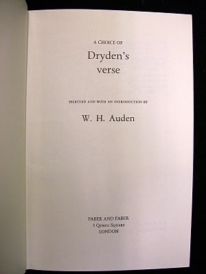
Now, while I had my heart set on spending that snowy afternoon with much older books, let it be said that there is a great deal of fun to be had in the general stacks. If nothing else, cruising the stacks reminds you that a well-designed book is a rare thing. As you run your hand along the spines of the books, what you see is more often than not the result of the lazy thinking, poor workmanship, and general meanness of the book trade. It can get depressing in a hurry. But every once in a while books come to hand which suggests cause for hope.

Two examples of such ‘ahh-ha!’ volumes from Friday come to mind. One is A Choice of Dryden’s Verse, published by Faber & Faber in 1973. In this volume, it was W.H. Auden doing the choosing. I generally like Faber’s designs from this era and earlier. They are almost always restrained and careful. Everything adheres to a simple hierarchy. There is no showiness here.

Well, almost no showiness. I snorted when I saw this uses of two double-daggers to bracket the folio (that is, the page number). I’d never encountered such a use of a double-dagger before. In fact, you rarely see this glyph used anywhere anymore, unless someone is typesetting using the traditional set of footnote markers to which it belongs. This use feels a bit unnecessary, calling undo attention to the folio, but the playfulness made me grin.

I also discovered a four volume set of The Complete Works of William Congreve which was published by the Nonesuch Press in 1923. It was issued in a limited edition of 900 sets, with this set numbered 470. One of the things that I like about the spine lables is the inventive use and arrangement of asterisks (another glyph from that traditional footnote set) to indicate the volume number.

Nonesuch Press was founded in London by Francis Meynell (1891–1975) in 1922, with its first book, John Donne's Love Poems, being released in May 1923. This Congreve set was also from that inaugural season.
One of Meynell’s ambitions was to demonstrate that modern composition and printing techniques and machines (Monotype casters and power presses) could produce books that was every bit as distinguished as (and a hell of a lot less expensive than) the books produced by the private press movement. His was an attempt to marry the skills and knowledge of the past age with the best technology of the present. By and large, Meynall succeeded in this goal. It didn't hurt that he was a gifted writer and first-rate typographer, with a knack for working with fleurons and ornaments. His example has been one that has had a great influence on the way we do things at Gaspereau Press.
ANDREW STEEVES ¶ PRINTER & PUBLISHER


No comments:
Post a Comment