

Jonathan Cape’s new edition of Bringhurst’s Selected Poems has a simple and attractive offset-printed cover. The colours are reproduced using a CMYK process. The book has cover flaps and a black end sheet. A pretty spiffy edition for a big trade publisher.

Gaspereau Press’s original edition of Bringhurst’s Selected Poems. The jacket employs a black felt-finish paper handprinted in two colours on a letterpress. I’m not sure that it’s better or worse than Cape’s; it’s just a different process and it gets a different result.
When we resell rights to publishers in other territories, I'm always excited to see how they handle the material. Editorially, the Cape edition is a somewhat different selected. They wanted a slightly smaller selection. They were also unable to budget for the printing of Bringhurst’s polyphonic works in multiple spot colours. Much of the polyphonic work was simply omited, but a few things, like “Conversations with a Toad,” appear in monochromatic form. Robert has only rarely been able to convince publishers to shoulder the expense of his experiments, so he is used to this problem. In the Gaspereau edition, however, we used a fair amount of spot colour.
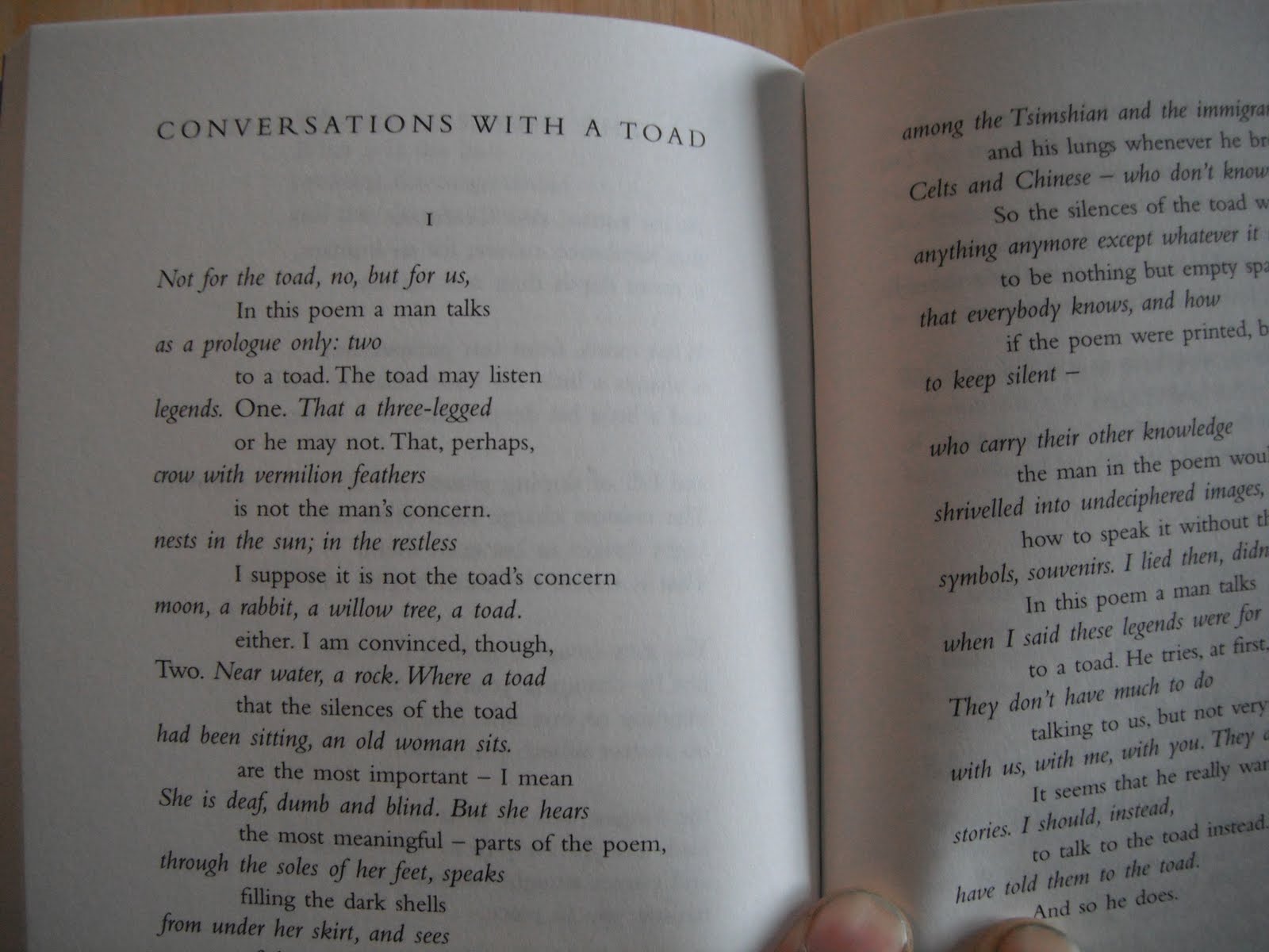
The Cape setting of “Conversations with a Toad.”

The Gaspereau setting of “Conversations with a Toad.”
Neither Robert nor I had any hand in the design of the Cape edition, which was done by a firm in England. And Cape has a house style for its poetry series. On the whole, the typography of the Cape edition is clean, simple and workmanlike. The type is Bembo, which generally works well, though wonky spacing is a problem here and there. The generally over-wide word spacing, for example, seems at odds with the modest leading. (Compare the word spacing in the two samples above.)

What’s Robert thinking in this photo? Perhaps he’s thinking “You could drive a bus between the word spacing in that bio! Would a hyphen have killed you?” I know I am.
Well, a few typographic differences of opinion aside, it is a great little book and a credit to its publisher. Hats off to the gang at Jonathan Cape for bringing Bringhurst to the United Kingdom.
ANDREW STEEVES ¶ PRINTER & PUBLISHER


1 comment:
Perhaps he’s thinking “You could drive a bus between the word spacing in that bio! Would a hyphen have killed you?”
-- bwa-ha-ha! chortle.
Post a Comment