14 February 2010

Sylva: Cruising Timber & Type

Part of the joy of hounding around in the library is the accidental nature of discovery. This is also one of the things that attracts me to birding and walking the woods. No matter what you know of bird song, habit, or field marks, you’re still reliant upon the luck of being in the right place at the right time with your eyes and ears open.

It helps to know where to look, however, and since the sociological side of literature and research interests me as much as books themselves, many of my bibliographic adventures begin with cruising the library’s re-shelving carts. When I go into an archives, I want to know what other people are curious about and see what items were recently requested for viewing. It’s a bit like looking for salamanders, though. You can turn over a lot of rocks before you find anything interesting.
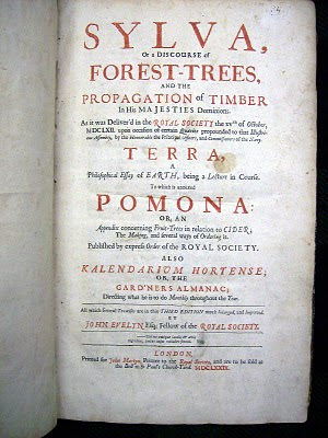


Recently, at the bottom of a stack of more contemporary books, I spied a battered copy of the third edition of Sylva, or, A Discourse of Forest-Trees, and the Propagation of Timber in His Majesties Dominions (1679) written by the English horticulturist and diarist John Evelyn (1620– 1706). I wonder who had been looking at it, and why?


I knew of this book from Thoreau, who refers to it briefly in Walden and mentions it again at greater length in his journal a few years later. On 6 June 1852 Thoreau comments:

Evelyn has collected the fine exaggerations of antiquity respecting the virtues and habits of trees and added some himself.[…] If the oft-repeated glorification of the forest from age to age smacks of religion, is even druidical, Evelyn is as good as several old druids, and his “Silva” is a new kind of prayerbook, a glorifying of the trees and enjoying them forever, which was the chief end of his life.

Evelyn’s Sylva is a practical guide to arboriculture intended to improve the understanding and practice of forestry. It was first published as a paper presented to the newly constituted Royal Society in 1662. This third edition was printed for the noteworthy London bookseller and publisher John Martyn (d. 1680), whose shop was located in St. Paul’s Churchyard under the sign of the bell. Martyn, in partnership with John Allestry, had acquired the lucrative monopoly as printer to the Royal Society in 1663.


A couple of different text types were used in Sylva. The two types used in the pages reproduced above, while similar in structure, are quite different. Most obviously, the first one has a more lively italic which makes liberal use of swash capitals.


In the days of handcut punches, each size the punchcutter cut was essentially a variation on a theme as he made countless little refinements and alterations in order to achieve the best visual result at each size. One such variations is clearly seen when these two roman types are scaled to the same x-height and similar words are set side by side. Note how the extenders are taller on the first type than on the second. Types cut for smaller sizes tended to have shorter extenders, even when the structure of the letters was otherwise similar.

Whatever Thoreau made of Evelyn as a botanist, he certainly found Sylva fertile ground as a work of literature. Her wrote in his journal on 23 March 1953:

Evelyn and others wrote when the language, was in a tender, nascent state and could be moulded to express the shades of meaning; when sesquipedalian words, long since cut and apparently dried and drawn to mill, – not yet to the dictionary lumber-yard, – put forth a fringe of green sprouts here and there along in the angles of their rugged bark, their very bulk insuring some sap remaining; some florid suckers they sustain at least. Which cords, split into shingles and laths, will supply poets for ages to come.

ANDREW STEEVES ¶ PRINTER & PUBLISHER

10 February 2010

The Planter Typeface


When I first arrived in the Annapolis Valley back in the mid 1990s and started looking into the history of the place, I was attracted to the work of a primitive stone cutter whose sandstone markers were found in many of the local graveyards. The decoration caught my eye first, but the lettering was what really hooked me.

Known only as ‘The Horton Carver’ (his name has not yet turned up in any period documents, such as invoices or probate records), his stones start appearing in the 1770s in burial grounds all around Nova Scotia’s Minas Basin – places like Kentville, Wolfville, Gaspereau, Chipmans Corner, Horton, Cornwallis, Onslow, and Londonderry, for example. Previous to this, if you were important enough (i.e., wealthy) to have your final resting place marked with a cut stone (instead of wood, or nothing), the stone was most likely carved in New England and imported. With the arrival of the New England Planters in the 1760s, the economy and population grew to the point where a local market for stone cutting evolved. You can read more about the Horton Carver and Nova Scotian gravestones in Deborah Trask’s excellent book Life How Short, Eternity How Long: Gravestone Carving in Nova Scotia (1978), or in her article “Remember Me As You Pass By,” which is available online. You can also see more Horton Carving stones by visiting the Farber Gravestone Collection website.


At any rate, I was attracted to the purposeful but amateur letterforms made by this local carver and started to hunt down and document as many of his stones as I could find. Most of Trask’s study has concentrated on the imagery, decoration and the text written on the stones, and less on the structure and form of letters themselves. Before long, I started thinking about making a digital typeface based on the Horton Carver letterforms, but there were many problems. I had to learn how to use the tools, for starters. While I had a significant sample to work with, many characters were not existant on the stones. And these letters were ‘purpose built’ for large size display, not for continuous reading at 10 or 12 point (which is my typographic neighbourhood). So I kept studying the stones, honing my skills and stewing over the Horton letters.


Last spring, Gaspereau Press was hired to design and print a small series of books for the Kings-Hants Heritage Connection, a group of local historical societies. Written by Julian Gwyn, the books commemorate the arrival of the New England Planters to Nova Scotia in 1760. These were the people the Horton Carver lived with and carved for. It seemed like the perfect excuse to invest some time on the Horton Carver project. Within a couple of weeks, I had completed a working set of capital letters and a rough draft of a lowercase roman. I decided to name the type Planter and use it to set the display headings in the Planter history books we were preparing to produce. It mated well with Adobe Caslon, which I used to set the body text.


These history books have been coming off the press this past week. The version of the Planter type I used in the books is still rather preliminary – as rough, illfitted and wonky as its handcut models, yet beautiful too. For all its imperfection, it was gratifying to see printed sheets coming off our presses that employed a letter which was first cut in sandstone with a chisel 250 years ago – and not in New England or Holland or Italy, but right here in this backwater place. And how many books can boast a type that is quite this apropos? It makes me grin to be able to carry on the work started by this unknown lover of letters, paying my small tribute to his craftsmanship.


ANDREW STEEVES ¶ PRINTER & PUBLISHER

07 February 2010

Two Books from Klanak Press


I wandered over into the Canadian Literature stacks at the library the other day to browse around for interesting books, and had the good fortune of reacquainting myself with William and Alice McConnell’s Klanak Press, a private press active in Vancouver between 1958 and 1990. Two of their books coincidentally came to hand during this particular outing. (I could always seach the on-line catalogue for the press's books, but foraging is more fun.)


The first Klanak Press book I found was Klanak Islands: Eight Short Stories (1959), which was designed by Takao Tanabe and printed by the Morriss Printing Company of Victoria. The emblem was designed by the renowned Haida artist Bill Reid. I'm particularly fond of the asymmetrical typography of the title page.


The table of contents is also clearly organized. While designers generally like to show off their skills on covers, title pages and chapter openings, I tend to think that you can tell more about a designer by looking at how they handle more workmanlike elements like lists and appendices. If they are alert and wily here, handling the more prosaic pages eloquently, you know they are truly on top of their game.


The chapter openings are also lovely, returning to the asymmetry established on the title page. The drawing is by Vancouver artist Don Jarvis.


The second Klanak Press publication I admired that day was Ralph Gustafson’s Rocky Mountain Poems (1960). This book was designed by Ben Lam and printed at Morriss. The cover is a spirited mix of traditional elements (like the Caslon type and the boarder design which anchors the page) and a nontraditional flush-right justification of the title type. The use of colour and space are simple but excellent.


On the title page, the title typography remains in Caslon all-caps, but it is now left justified and cantilevered out over the balance point of Reid’s emblem and the publisher’s information at the bottom of the page.


One of the things I love about the design of this particular book is the way in which the poems are aligned to the bottom of the page, not to the top. This is a tricky technique to carry off successfully; it requires a sympathetic text and is always in danger of becoming simply a gimmick. However, this is a short book (36 pages), and each opening feels fresh. Note the location of the folio (page number) in relation to the poem titles and the body text.


According to Robert Bringhurst’s short biography of the press in Ocean Paper Stone (a chronicle of publishing in British Columbia issued by bookseller William Hoffer in 1984), William McConnell began setting type and collecting books at the age of twelve, and while he went on to a career in law, it is clear from the beautiful editions he produced that his heart remained with books all his life. The texts of all but one of Klanak Press’s books were set in Intertype Baskerville and printed by Morriss.

ANDREW STEEVES ¶ PRINTER & PUBLISHER

01 February 2010

Starting work at the Dawson Room


Calligrapher, illustrator and Albion wrangler Jack McMaster and I drove into Halifax tonight to lend a hand at the Dawson Printshop, which is housed at the Nova Scotia College or Art and Design. There was a good number in attendance for this the second meeting of the loose association of letterpress folk and Dawson Printshop supporters. Type designer Rod McDonald kicked things off by showing off his copy of the beautiful of portfolio Wood Type of the Angelica Press, published in an edition of 200 copies by the The Angelica Press of New York in 1976.


So inspired, we set to work. The collection has been in a bit of disarray since its move from the care of one university to another. There are many galleys of type to sort and distribute, and much reorganization to undertake. The hard part with a job this large is just knowing where to begin.


While others sorted cuts and furniture, Jack McMaster and I started into the galleys of mismatched sorts and pied fonts of wooden type, trying to reunite lost letters with their kinfolk. Jack took on a saintly glow standing under the low fluorescent lighting of the type cellar.


Rod and I discovered an unopened package of 30 point Helvetica Medium foundry type, direct from Stempel in Germany. Everywhere I looked my suspicions about this collection’s interest, utility and overall value to the college and the community were further confirmed.

ANDREW STEEVES ¶ PRINTER & PUBLISHER