

Glenn Goluska in his apartment
For a number of years now, and almost without fail, Montreal-based typographer and letterpress printer Glenn Goluska has been making an annual fall trip to Kentville to attend the Gaspereau Press wayzgoose. Year after year I’ve promised Glenn that I’d drop in and visit his printshop near the Lachine Canal in Montreal. As a carrot, Glenn’s been holding a promised copy of one of his more famous letterpress broadsides as bait, insiting that I come by and collect it in person.

The Goluska Printshop
It’s no simple thing to escape the responsibilities of our under-staffed and overworked printshop. But at the end of March, I finally made good on my promise, driving up to Montreal for a two-day visit and taking Rod McDonald – designer of the typefaces Laurentian, Cartier Book, Slate Sans, Smart Sans … – as my copilot. No surprise, type and design occupied at least 75% of our conversation over the duration of our 20-some-hour round trip.
Glenn Goluska, I should mention, is one of the most astonishing typographic designers I’ve encountered in this country. His portfolio of trade design work includes a veritable library of literary books designed during his heady early days at Coach House Press in Toronto, an incomparable collection of posters and catalogues designed for the Canadian Centre for Architecture in Montreal, and countless book jackets designed for McGill-Queens Press. A few examples (taken quickly, in poor light):


Glenn’s also an accomplished letterpress printer and Linotype operator, and his Imprimerie Dromadaire and Nightshade Press are responsible for many stunning private press publications. Some of my favorites include Alexander Urusov’s The Cry of Distant Ants (1978), Margaret Atwood’s Unearthing Suite (Grand Union Press, 1983), Scott Joplin (1983) and Robert Kroetsch’s Liebhaber’s Wood Type (1987). By amd large, the type for these books was composed on Glenn’s Linotype model 31 caster using and his excellent collection of Linotype typefaces – Electra, Falcon, Palatino, Optima, Metro Black, Trump. He has also handset many pieces from the hundreds of drawers of lead and wood type he has collected over the years, including a number of rare fonts of Cyrillic.

The cover of bpNichol's continuum

A spread from Alexander Urusov’s The Cry of Distant Ants (1978)

Cover of Scott Joplin (1983)

A spread from Robert Kroetsch’s Liebhaber’s Wood Type (1987)
We spent most of our visit sitting around in cafes, restaurants and in the printshop talking about printing and type, but Rod and I also made contact with a few other folks who are active in Montreal’s typographic scene. On Friday, we visited Judith Poirier at the University of Quebec at Montreal. Judith made a short animated film called Dialogue by printing directly on the filmstock using lead type and a vandercook proof press. Her book about the film, also called Dialogue, won an honourable mention at the Alcuins and was shortlisted at the 2010 Leipzig Book Fair. Judith’s letterpress work uses type playfully, more as a graphic element than as a system to construct words, paragraphs and books.

Judith Poirier & Rod McDonald at UMAQ
The work of typographer and Dawson College instructor George Vaitkunas is more of my ilk. Vaitkunas joined us for a chat and Linotype demo in Glenn’s shop on Saturday afternoon. He’s designed some great award-winning books over the past few decades for publishers like Douglas & McIntyre and UBC Press. I expect that we’ll soon find an excuse to invite him to speak at a future wayzgoose.
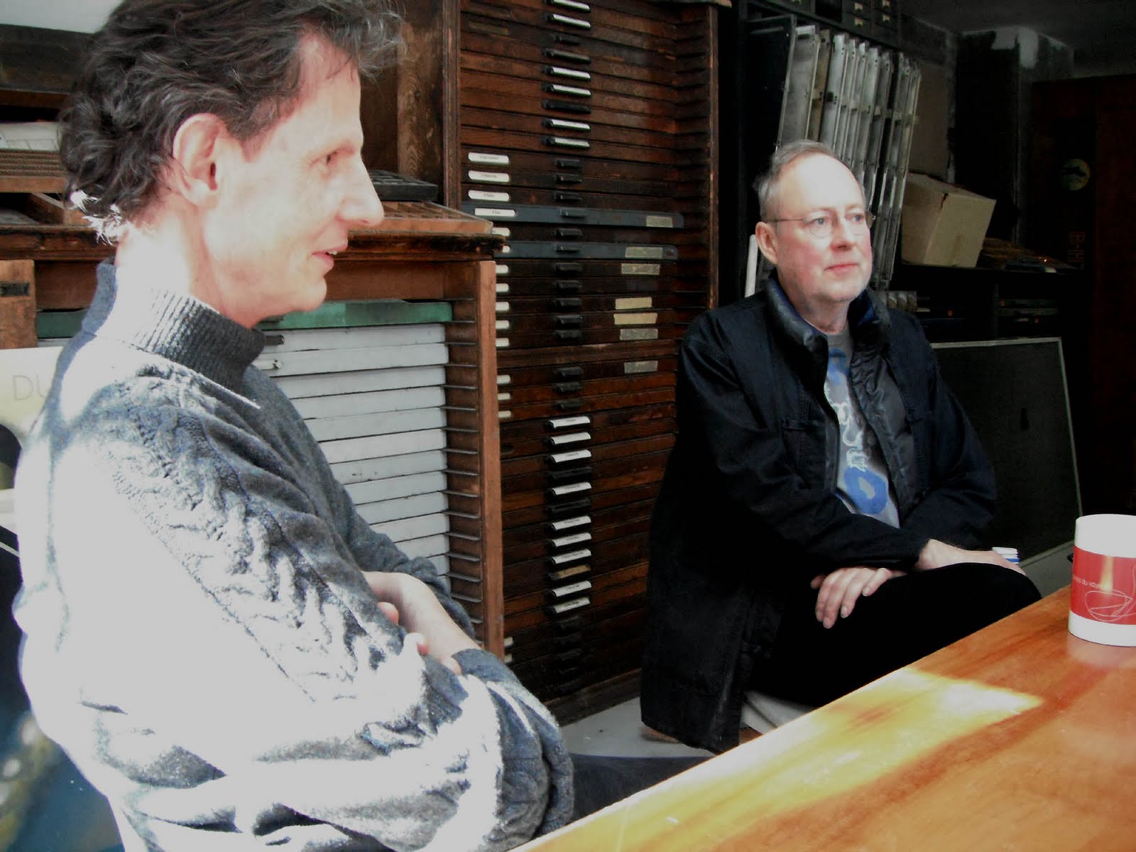
George Vaitkunas & Glenn Goluska in Goluska's shop
Paper maker David Carruthers also dropped by for a quick visit, though a plan to tour the St. Armand paper mill didn’t work out due to time constraints.
Well, it was a quick trip, but an inspiring one. On the drive home, Rod and I talked at length about the influence Glenn’s work and friendship has had on our own careers and the impact his work would have on the next generation of designers if his work was actively used in the teaching of graphic design in Canada. Like so many of the best typographers, his work is not as widely known as it could be, mostly because Glenn has worked away quietly all these years, perfecting his art, not drawing undue attention to himself or his work.
In encountering Glenn’s typographic design I have often found, as in Thoreau’s writings, unanticipated companionship in the confirmation of things I had long been muddling through and sorting out on my own, discovered that my own peculiar ideas and seemingly idiosyncratic methods of working them out had previously – with equal peculiarity and idiosyncrasy – been worked out, and sometimes in an uncannily similar fashion, by Goluska on his own journey of learning the art of book design. This discovery is not unlike overhearing the dialect of your native village spoken by a stranger in on the other side of the world: your head turns involuntarily toward its familiar music; you recognize it, and it recognizes you, and you are suddenly at home.
ANDREW STEEVES ¶ PRINTER & PUBLISHER


2 comments:
Wonderful post. "This discovery is not unlike overhearing the dialect of your native village spoken by a stranger in on the other side of the world: your head turns involuntarily toward its familiar music; you recognize it, and it recognizes you, and you are suddenly at home." I think this every time I look at a Gaspereau book...
Theresa Kishkan
Great stuff. very incisive post, i really appreciate it. The example you have shown in your post is really good and easily.Thanks for sharing understandable.
Post a Comment